- Maker: Tatyana Booz
- Genre: Logotype, Stationery Set
- Level: Graduate
- Program: Composition, Rhetoric, and Digital Media
- Course: WRIT 5800: Editing, Layout, and Design
- Instructor: Dr. Eric Mason
- Semester Created: Winter 2020
Description:
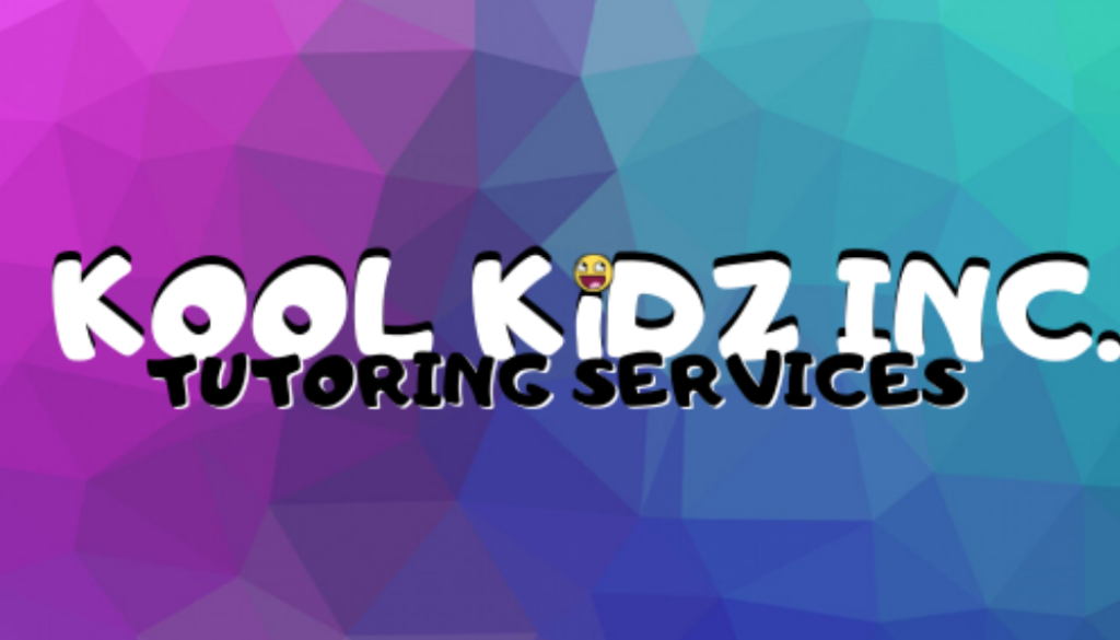
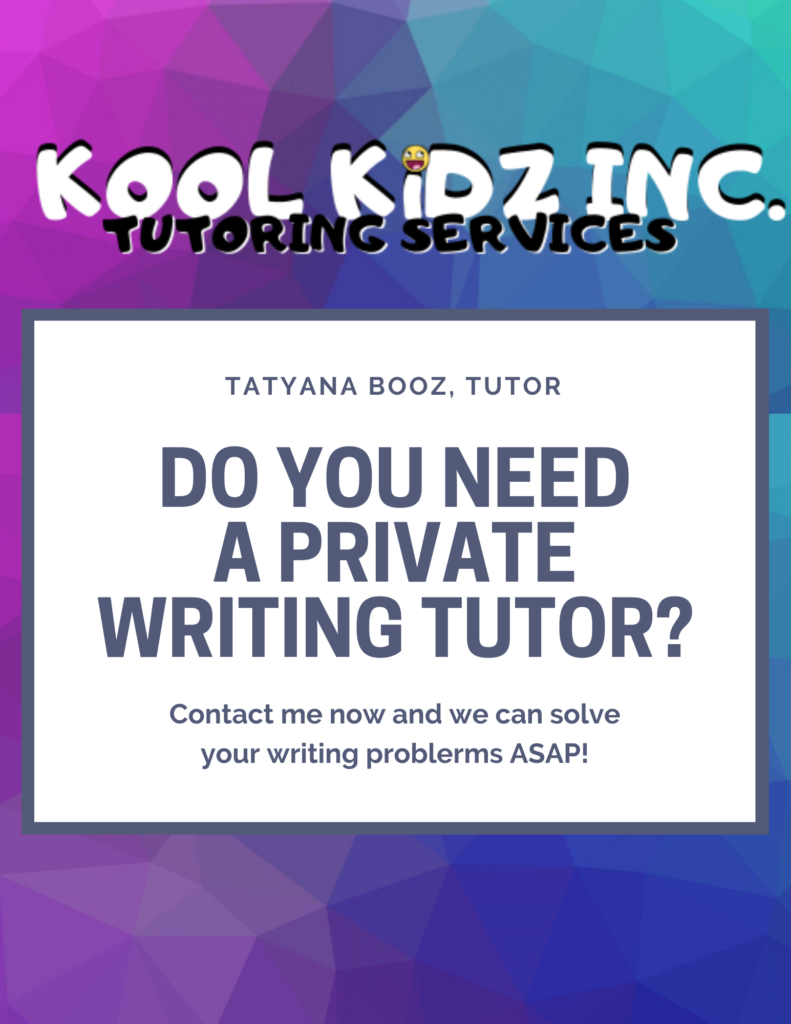
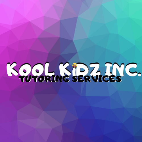
The logotype I created is for a tutoring service on writing that I plan to offer to students from kindergarten to the twelve grade. The focus of the company is to give grade school students the tools to be successful in their writing courses at school. I also created a stationary set (i.e. business card and flyer) to showcase what Kool Kids has to offer. The logo and the stationery set is designed to insight playfulness as well as giving the customer the idea that this is a serious business.
Reflection:
I thought designing the logo for the course would be an easy task for me especially, because I have ample experience in editing graphic images. But, as I went through the design process that was not the case for me. I believe what I mostly struggled with was taking all of the ideas in my head and compiling them into one cohesive thing. But, going through the empathize and define process it has allowed me to take all of those ideas and put them in one special place; my commonplace book. My commonplace book was amazing in helping visualize my visions for my logo. At first, I was a bit discouraged because I do not draw well but as I started to design it allowed me to really get my gears going.
Initially, I was going to take on a logo on the website that Dr.Mason told us about but for some reason I did not feel a connection to the client and to the creation of the logo itself. Therefore, I thought about my needs as a “client” and what I would expect to be created if someone were creating a logo for me. I never create logos for myself because I never know how to go through the empathize and define process through my lens/space so, I decided why not accept the challenge.
I chose to create my final logo using Canva but originally I was exploring other vector art softwares. I played with the elements of Inkscape, Adobe Illustrator, and even other third-party vector art softwares. None of these softwares gave me the elements that envisioned for my logo. Some of the logos that I created in different vector softwares I was not too fond of them as much as I was fond of the logo that was created in Canva. So, I stuck with Canva especially since I am familiar with that platform already.
Moreover, I wanted my logotype to reflect the coyness and the playfulness of childhood. I chose bright colors to appeal to students and their parents equally. I want my logo and my stationary set to be inviting and to show students that tutoring is not always a drag. I enjoyed creating this content because it allowed me to really take a deep look at myself and evaluate what I like and what I do not like as a content creator.
