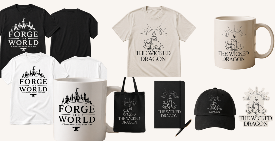
Description This logo was created for the Sint Maarten Aquatics Federation which currently only encompasses competitive swimming and open water swimming but is looking to expand into diving and waterpolo. This logo is meant to be used as the official logo for board representatives, athletes, coaches, and the corresponding support team for T-shirts, polos, and […]
logo
Project 1 LOGO- 5800
Description My logo for the holiday sports camp includes the letters #AG. This stands for “ALL GOD” because I’m a Christian, and I believe everything I do is for God. When I made my logo, I wanted it to look professional and work well for other brands or companies I might start. It took a […]
Project 1 LOGO- 5800
Description I designed this logo for a client who has been running her business with the same logo for the past four years. She specifically requested “Fancy” lettering, which led me to select this particular font for her new logo. Additionally, she emphasized a preference for pink as the color scheme. To further enhance the […]
Project 1: Texpac Logo – 5800
Description For this project, I decided to give a makeover to my Texpac’s old logo. The company — a textile’s factory and distributor — is owned by my grandfather and has used the same logo since its inception, with very minor changes done over time. While the company has no real wish to change the […]
Cackle Logo Typeface
Description The above logo was created to represent the hypothetical ‘academic journal’ titled Cackle. Cackle was intended to be a journal that published scholarship on feminist media studies, the imaginary issue specifically dealt with the intersection between feminist rhetoric and genre studies, such as the Feminist Comedy *wink*. It was important to me to challenge […]