Meg Provenzale
Logo Design
Graduate
Composition, Rhetoric and Digital Media
Dr. Mason
Winter 2020

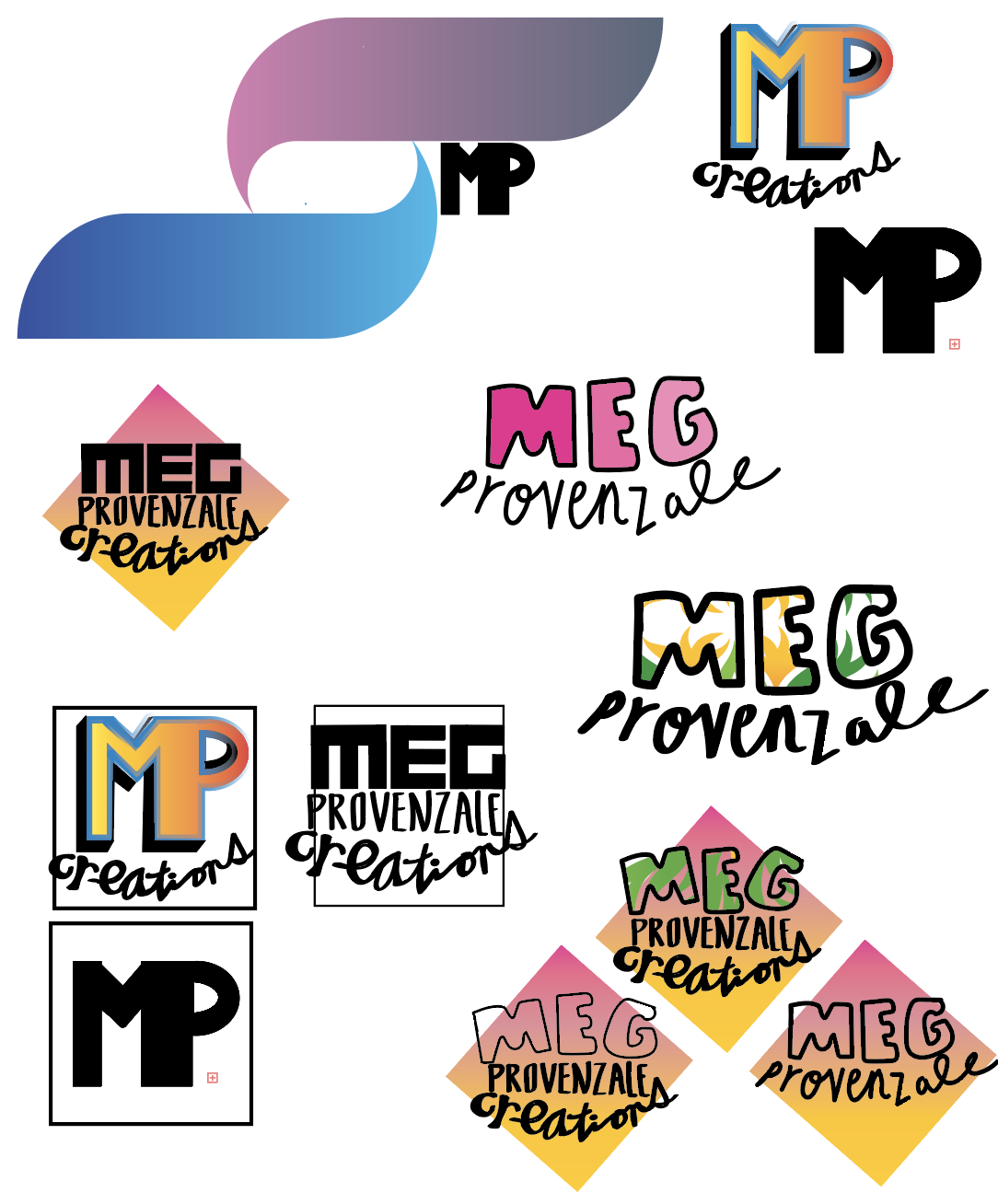
I used Adobe Illustrator to create this project. My font was created with Illustrator’s paintbrush tool and the shapes were created using the rectangle tool. I most commonly layered text over shapes and used maily yellow, black, pink and green. I wanted my design to be fun and colorful which is why I opted to create my texts by hand versus using a distinguished font. This logo will be featured on my personal WordPress. Its purpose mainly to inform reader’s or visitors of who I am, and also to create a visually unique experience.
While creating my logos I noticed the design process was a lot like writing but more based around how to use space visually. I found myself cycling through designing and revising stages to find what worked best for my logos. I found that by creating as many different styles of logos as I possibly could, it enabled me to understand what I liked or did not like for my final one. After familiarizing myself with Illustrator a bit more and receiving feedback during class, I am mostly satisfied with my final product. The bottom three logos in the right hand corner are my finalized product. I created the final logo by mixing two different drafts of my logos.
I would not consider my logos conventional. Mainly because they were created to represent myself and not a brand with a high need for brand recognition or values. This freedom allowed me to use dramatic colors and bold lines simply because I like how it looks which was so much fun!
