- Maker:
- Genre:
- Level: Graduate
- Program: Composition, Rhetoric, and Digital Media
- Course: WRIT 5800: Editing, Layout, and Design
- Instructor: Dr. Eric Mason
- Semester Created: Winter 2022
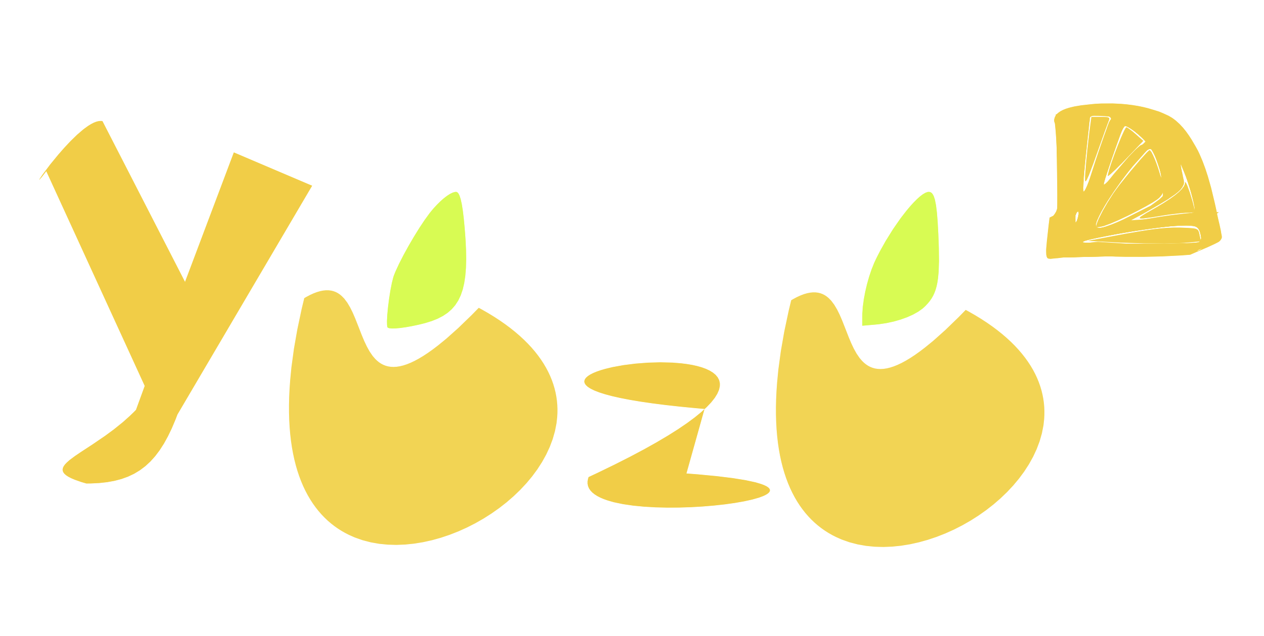
Reflection: Yuzu was conceptualized to be a distributor of anime and or Japanese content. While I doubt I’ll ever go into licensing, this logo was created for this pseudo brand. Taken from the Japanese citrus fruit, yuzu, this logotype aims to evoke a refreshing feeling (similarly to brands that use the quintessential lemon-lime color pairing like Sprite).
The almost golden rod color of the actual logo is inspired by the Sherwin-Williams paint color “Jonquil”, which is a brilliant yellow. I think this color is attractive and draws attention to the logo. The logo also features negative space to form the “U” in yuzu. A lime-green leaf was added at the top of each U to ameliorate the fact that the circular shape of yuzu fruit was compromised to make this design. Therefore, the leaf allows the viewer to infer that the “U” letters are supposed to be fruit.
The letters were created using the free software InkScape, and the shapes were achieved by manipulating vector points in the letters. I am happy I could avoid using an Adobe product and achieve a decent design.


