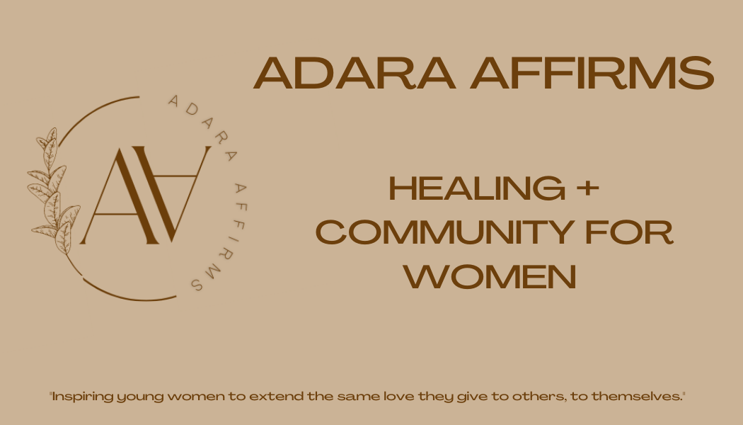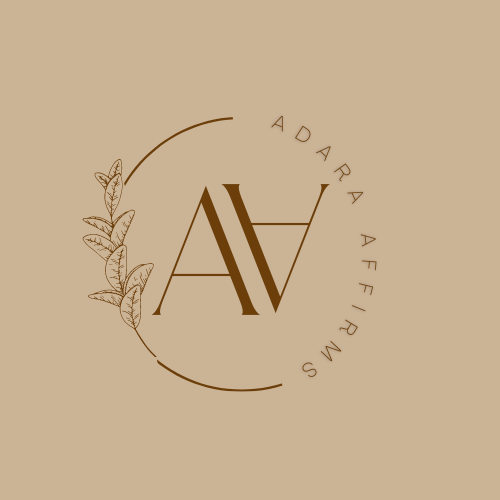
The file includes the front and back of the business card.
- Maker: Adara Cox
- Genre: Business Card (Document Design)
- Level: Graduate
- Program: Composition, Rhetoric, and Digital Media
- Course: WRIT 5800: Editing, Layout, and Design
- Instructor: Dr. Eric Mason
- Semester Created: Winter 2022
Discussion:
As a part of the rebranding of my business/healing community, I designed a new business card that fit the theme of Adara Affirms. Because my business is focused on the healing journey, I wanted to use soft/cool tones such as tan and brown. I am impressed by how great my business card came out, as it turned out much better than I imagined.
Reflection:
The process that it took to design my final iteration of my business card was not easy. I designed about 8 different designs that all look very different from each other. The first three I created were probably my least favorite, as I was using new technology that I was unfamiliar with. I tried to play around with it quite a bit, but it was not working out too well. So, I decided to go with what I knew best, Canva. And that was the best decision I could make for the redesign of my business card. I knew that I wanted to use the colors tan and brown; and I also knew that Canva had the exact color variations of both tan and brown that I wanted.
With using tan and brown, I searched for templates that I could make my own, and that, were similar to what I was imagining my logo to be. I wanted to place both A’s for Adara Affirms in the middle of a circle that also had the full name, Adara Affirms, as a part of the completion of that circle. It took me about an hour to find the right template and about another hour and a half to play around with it to become what I had in mind. The original font style of the template wasn’t something that I liked, so I searched for fonts that felt right for my brand. That took me about 30 minutes to find. Once I had the right fonts for my logo, I played around with the size, placement, and style of the letters in the circle. With the help of a classmate, I was able to get the placement of the letter A’s within the circle just right, as well as, the Adara Affirms completing the circle right, too.
A last minute decision of mine was to add the branch with the leaves to complete the circle. Because I had the idea of integrating the plants into my other text, the journal, I also wanted to keep that theme going for the logo. That element of adding the branch tied my entire logo together, nicely. I was very pleased with the overall finished piece.


