- Maker: Monique Cole
- Genre: Magazine, Parody
- Level: Graduate
- Program: Composition, Rhetoric, and Digital Media
- Course: WRIT 5340: Multimodality & Digital Media
- Instructor: Dr. Eric Mason
- Semester Created: Winter 2021
Description:
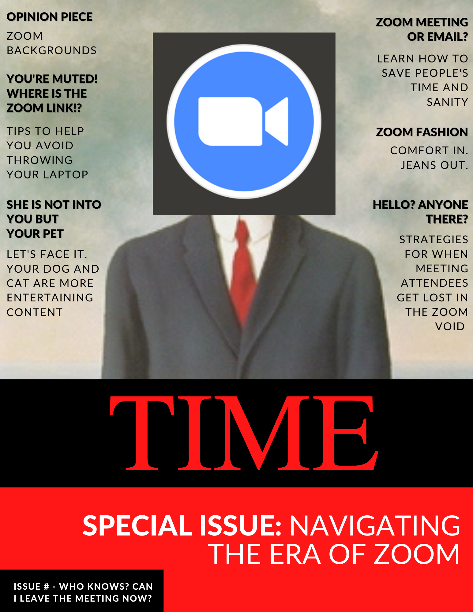
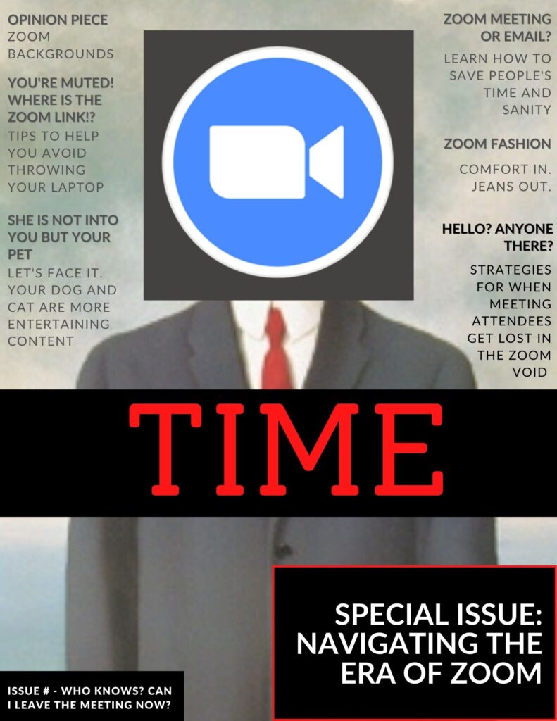
As human interaction has shifted to Zoom during the COVID-19 pandemic, the magazine cover is designed to poke fun at some experiences that occur when utilizing the platform.
Reflection:
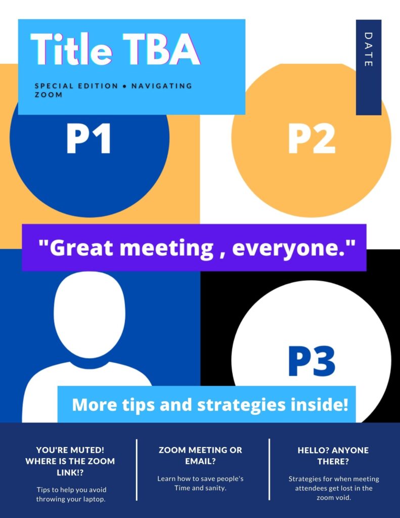
When I began drafting the project, I knew I wanted the graphic to contain a Zoom logo that took the place of a human face. I wanted to show that while we are connected via the platform to others during the pandemic, we can still feel isolated. The original draft contained two variations. The first version contained the painting called The Son of Man. The second version was inspired by Andy Warhol. The colorful 4×4 layout represented the grid-like format of the Zoom screen. I ended up going with the first option because it allowed me to add more story ideas while making the Zoom logo the focal point. Additionally, the color scheme fell more in line with the conventional genre of TIME magazine.
When creating the final version, I double-checked the font and type for consistency. This consisted of checking the size, spacing, and color. Additionally, the TIME logo was changed to Times New Roman to be more accurate to the publication. Everything else is left in Lato to increase legibility. I recognize the move as a break in design convention, which was done purposely to achieve a better aesthetic. The Son of Man image was also shrunken to allow me to play with space at the bottom of the magazine. Overall, I am happy with the layout I have generated. The thing I am the least satisfied with is the photo quality of The Son of Man. I tried gathering different versions and resizing them in Adobe Photoshop but could not achieve the desired look I wanted.
Materials Used: Canva, Adobe Photoshop
Rough Draft – Version 1
Rough Draft – Version 2
