
- Maker: Aidan Rivas
- Genre: Logotype, Stationery, Document
- Level: Graduate
- Program: Composition, Rhetoric, and Digital Media
- Course: WRIT 5800: Editing, Layout, and Design
- Instructor: Dr. Eric Mason
- Semester Created: Winter 2020
Description:
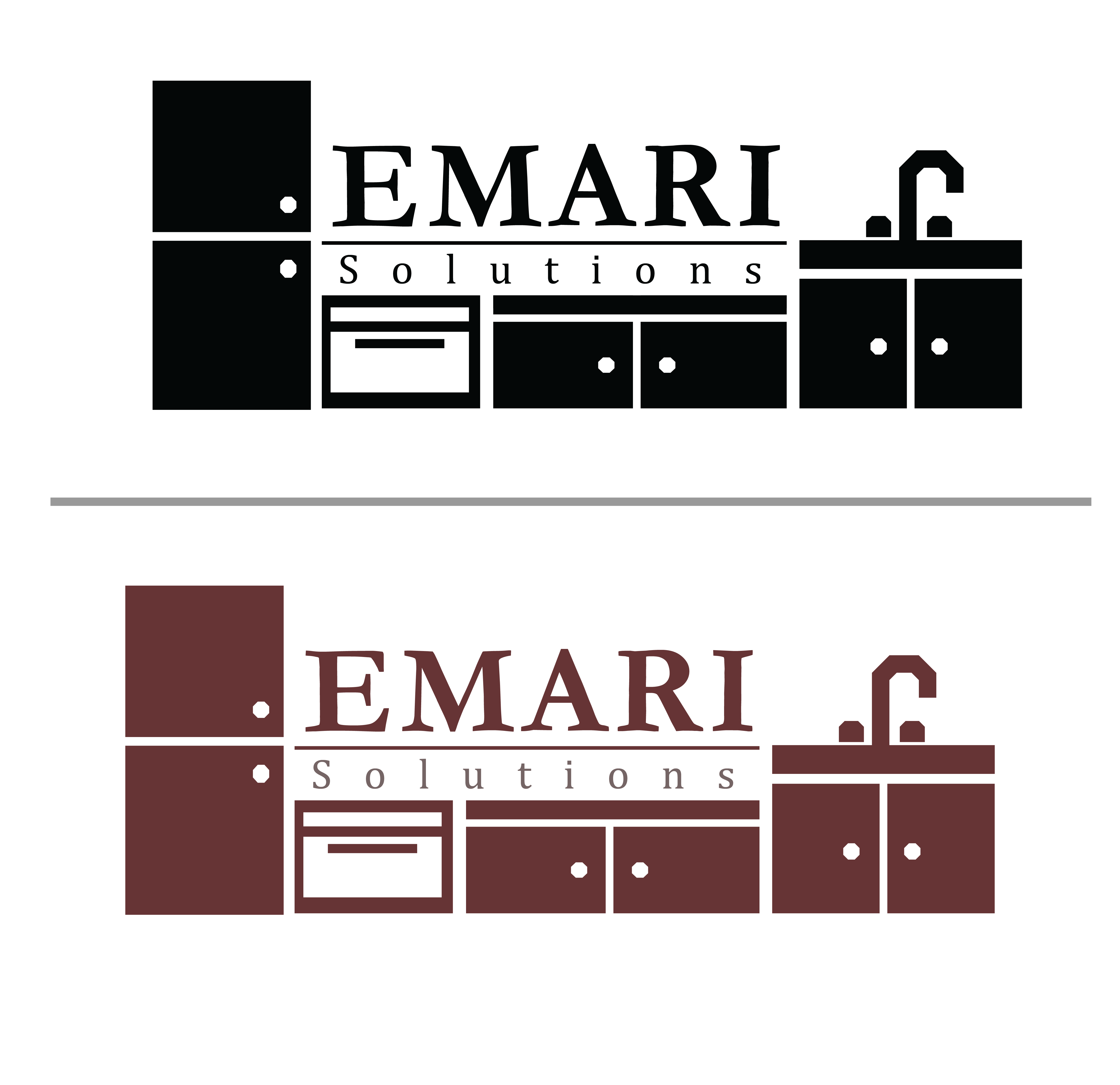
Emari Solutions is a kitchens and cabinet installation/remodeling company run by my father. Most of the jobs he gets are by word of mouth, so he’s never focused too much on having a solid company logo or brand identity. For our projects, as we were to design a logotype and a document relating to the brand of it, I decided to update my father’s logo and job contract.
My father requested the logo be something that represents the company and was eye-catching. While not a ton to work with, it did leave me a lot of room to play around with it.
The contract is given to each client and has a description of the construction project, its services, and parameters for payment. I wasn’t given any parameters for the design of the contract, but was met with enthusiasm at the idea of replacing the current one. The current contract has a very “created in Microsoft Word for its function” feel to it, so the goals are to update its theme to the new logo, and make the area that get filled out feel less “default”.
Reflection:
With the logotype, the design process was focused on creating a logo that made the services of the company immediately recognizable. I researched other logos related to construction and kitchens and cabinets to get a general idea of what to strive for. Most logos had either only text or an element that represented the company’s services. For the logo, I had the idea of “framing” the name of the company within its services. These ideas came first:


I ended up going with the 1st idea because it seemed the simplest idea to pull off while still suiting that “framing” concept. The 2nd and 4th logo ideas were the runner ups, but the 2nd was too complex, and wouldn’t scale well. Although I did love the idea of using wall tiling and a kitchen appliance in the logo. The 4th was just too basic, and I felt like it didn’t have much to say, even though I did see a lot of construction companies that used strictly type. I used Garamond Bold for the company’s name, and Cambria for the ‘Solutions’. While construction is not something I think of as particularly casual or serious, serifs are the standard from what I saw, so I chose common but not necessarily easily recognizable serif typefaces. I chose the color by looking through different types of wood colors, before settling on a ‘redwood’ type burgundy. While we do live in Florida, and that isn’t necessarily a local wood, I think it would be the most appealing as opposed to other browns.
With the contract, I wanted to take each part of the old contract and simply update it to modernity. The serif font used for the contract was also updated Cambria from Arial to match the logo. My goal was to make something consistent with the new brand identity, so I used the same burgundy from the logo to frame important sections, and included small accents in a tint of the color. The logo and contact information were left at the top, but put in Open Sans, a notably sans-serif font that is close to Helvetica in readability. I thought it was best to prioritize legibility for the company name, email, and phone number. The only request I got for the contract after showing a draft to my father was to leave the spaces for filling out specific costs in the form of that table.
