- Maker: Monique Cole
- Level: Graduate
- Program: Composition, Rhetoric, and Digital Media
- Course: WRIT 5800: Editing, Layout, and Design
- Instructor: Dr. Eric Mason
- Semester Created: Winter 2020
Description:
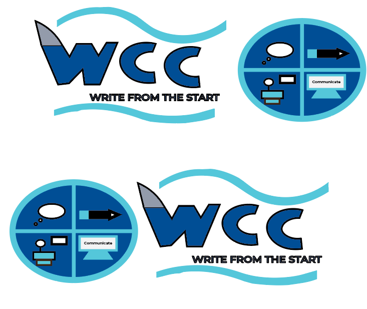
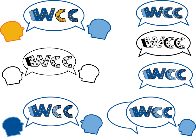
For Project 1, I created three hypothetical logo designs for the NSU Writing and Communication Center (WCC) since the center is not allowed to have an official logo. While the logo would not be “officially” used, I thought it would be a fun project to take on to tell the visual story of the WCC. The goal would be that the final graphic would be turned over to the WCC and could be modified in the future to be used as a different visual element for marketing or social media purposes.
Materials & Design Process: I began the design process by sketching various logos in my commonplace book based on an interview I had with my client, Kevin Dvorak, Ph.D. When designing the prototypes, I wanted to avoid cliché of using a pencil or pen in the logo. Overall, I was given full creative liberty. After a round of sketches and initial feedback from my peers and instructor, I brought the designs to life by using Adobe Illustrator.
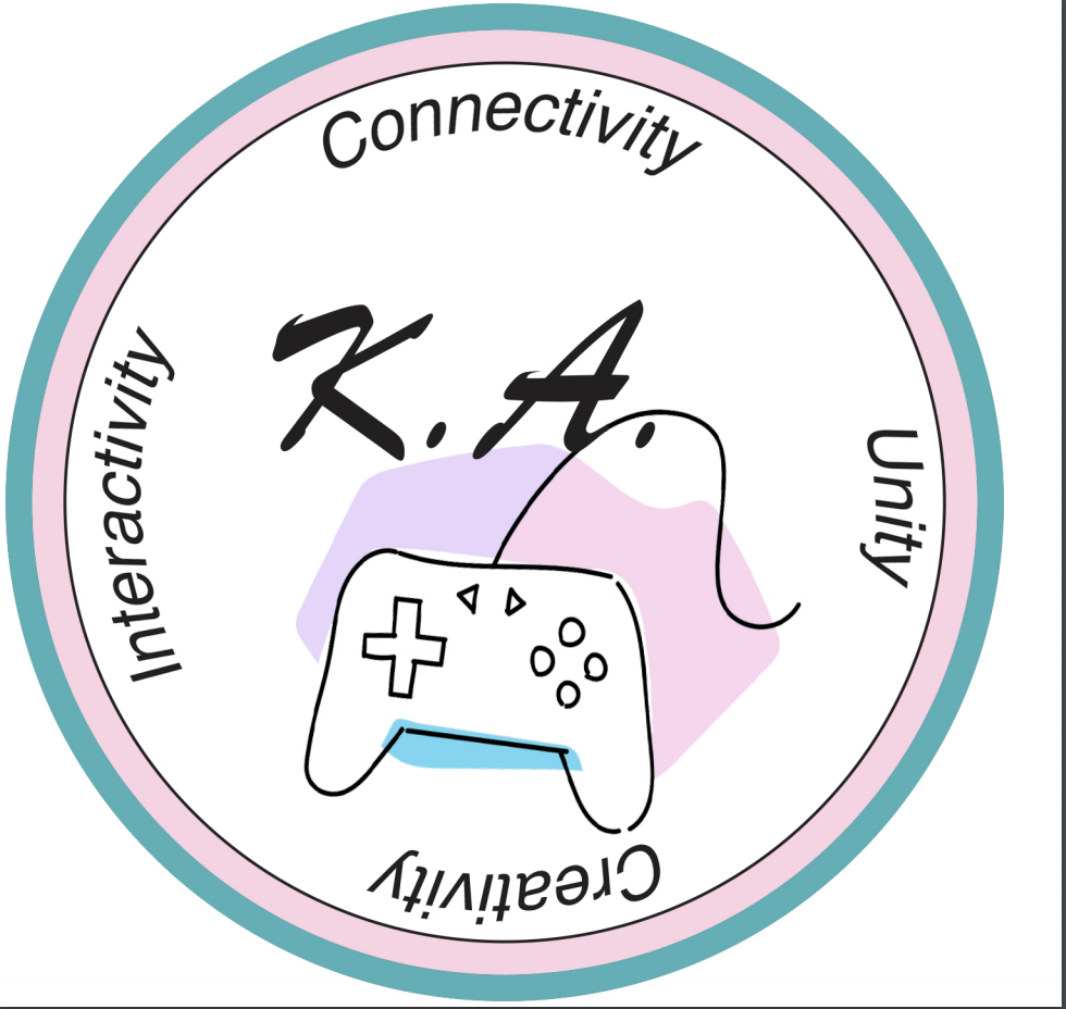
Logo #1 – The WCC provides one-on-one consultations to students to help them with their writing and communication assignments. Therefore, I wanted to make the speech bubble the main component of the design. I crafted various versions of the speech bubble that contained colors from the WCC’s style guide. Based on peer and client feedback, the edited version contains a more accurate looking speech bubble and different color variations. My client wanted to see a version that could be printer friendly. Additionally, he also liked having the letters outlined to increase readability.
Logo #2- While Logo #1 was my client’s favorite, I love Logo #2 because of its’ playful nature. Color plays a huge role in the logo’s design. The WCC is a very bright workspace that contains moveable furniture that creates a lively environment. Based on peer and client feedback, the edited version contains modifications to create a more accurate speech bubble and to have all the text be two dimensional. Unlike the first logo, where I typed out the letters, I drew the “WCC” portion by using the pen tool. The only feedback implementation that I struggled to implement with the final revision was trying to make two sperate speech bubbles to move around the main text.
Logo #3 – Logo #3 is my least favorite due to the difficulty I had when creating the graphic elements in the circle to showcase the services offered by the WCC. I did not bother to edit the logo because I wanted to devote my time to improving the other two logos. The only thing in the logo that I like is the inclusion of the mako shark fin on the “w” of the WCC.
Reflection:
The design thinking process played a huge role when I was creating my logos. The project allowed me to see how “good” design requires multiple steps, just like the writing process. Designs should be understood easily and be modified based on the client’s feedback. When designing, I am guilty of immediately jumping in the program and trying out different approaches. The introduction of the common book and sketching before designing was a change. However, it allowed me to try out multiple solutions, which saved me time trying to navigate a program I never used before the logo project. Learning about vector design was interesting since I am constantly using icons for social media marketing material. Out of the three-mock logos, I decided to spend my time modifying the first two designs. Both logos were met with praise and drew the attention of both my client and the classroom. I am glad that we could revisit our previous logos to modify them based on the peer, instructor, and client feedback. Overall, I am satisfied with how both logos #1 and #2 came out. The main theory that I used when crafted each design was the color theory. Color plays a huge role in telling the story of the center.
Logo #1 – First Attempt
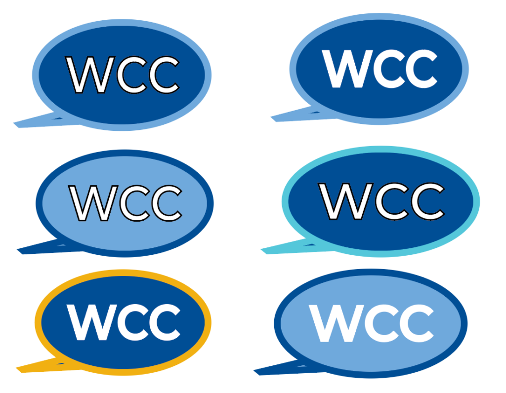
Logo #1 – Revised Logo
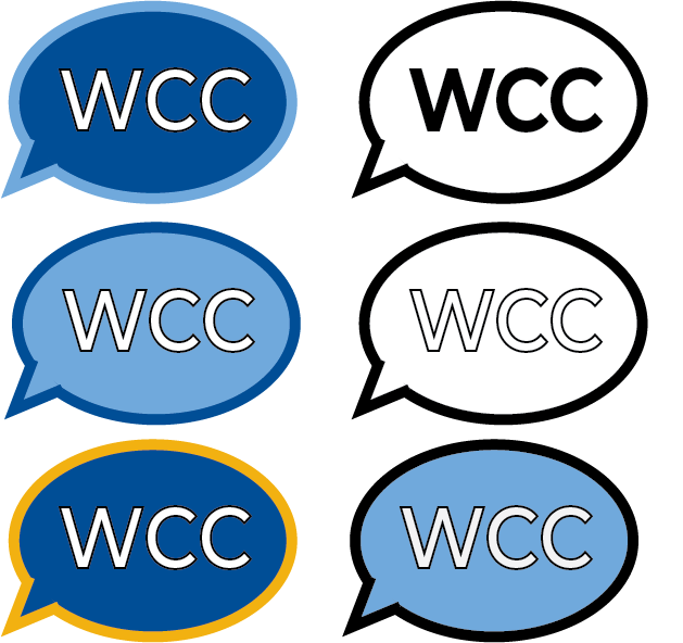
Logo #2 – First Attempt
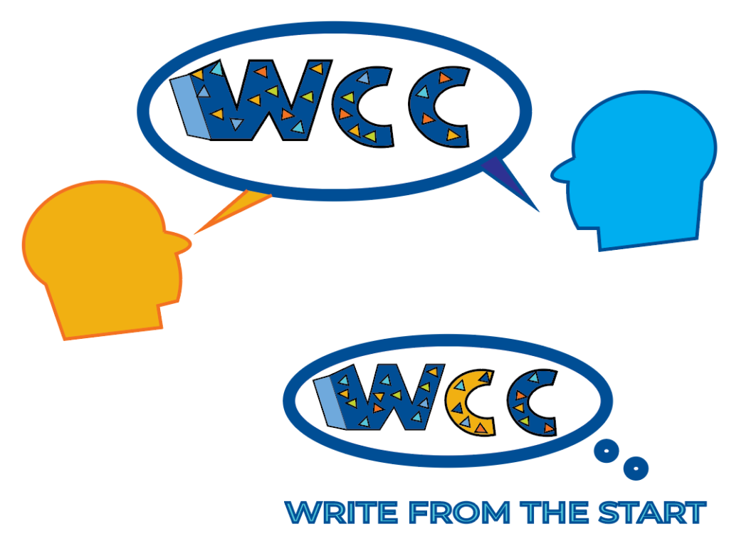
Logo #2 – Revised Logo
Logo #3 – First Attempt
