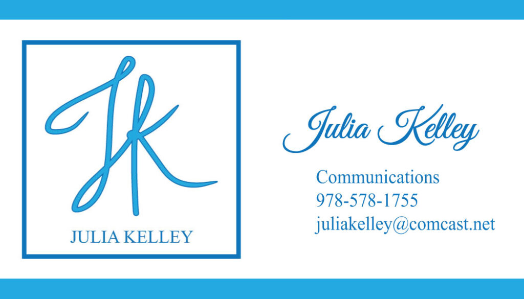


- Project Titles: Logo and Stationery Set: Business Card, Envelope, Letterhead
- Maker: Julia Kelley
- Genre: Logo and Text Projects
- Level: Graduate
- Program: Composition, Rhetoric, and Digital Media
- Course: WRIT 5800: Editing, Layout, and Design
- Instructor: Dr. Eric Mason
- Semester Created: Winter 2022
Description
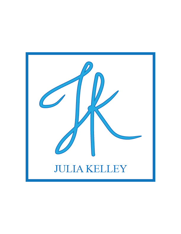
For the purposes of the logo project, I chose to design a logo for myself. I wanted to create a personal brand identity that could be articulated through my online portfolio, my resume, and other various marketing materials.
As it relates to color, my favorite color is blue, so I chose two blue tones (a light shade and a dark shade), both of which sit next to each other on the color wheel. Because they are analogous colors, I knew that they would complement one another nicely and effectively represent my personality and character. I also chose to create my logo in Illustrator because I wanted to become more proficient in this software program, as I know that it is a common industry tool. In terms of the actual design idea for the logo, I wanted my initials to be the focal point and I also wanted the initials to take on a hand-drawn look. Therefore, I drew the initials in Illustrator and manipulated the strokes to change weight in order to make the design appear more natural and authentic, as if I had drawn it on paper. I also wanted my full name to be positioned just below the initials so that my brand could be more recognizable as my own. I chose to include a box around the text to distinguish it from any potential space it could be positioned on, and I think this choice ultimately gave my logo a stronger presence, because all of the elements are “linked” together through the enclosure of a shape.
For the text project, I wanted to expand off of the logo design project to create personalized marketing materials to use for networking and self-promotion purposes in the future, so I chose to design a stationery set, including a business card, an envelope, and a letterhead. Furthermore, I have always wanted to create customary promotion materials, so I felt that this was a great opportunity to do so. Because each of these materials are part of my brand, I wanted them all to tell the same story, yet also stand solid on their own. I chose to incorporate various weights of thin and thick lines across the three designs based on my selected placement of the logo. I wanted to add depth and dimension to each piece of the stationery set while also maintaining a clean and organized layout. I also wanted to design the materials with the intention of making the important information the central focus, such as my name and my contact information.
Reflection
For both projects, I strongly considered the principles of design and the industry conventions for creating strong visual work. Referring back to the readings that we have discussed over the course of the semester was a consistent practice as I went through several stages of revision. The readings that were particularly helpful in the creation of these materials were the texts “Design is Storytelling” and “Editing by Design,” as both explained the complexities of design choices and design principles in a comprehensible way. Through the readings, I was able to directly apply the guidelines and the strategies of good design to my own work, which I think helped strengthen my vision for what I wanted each project to be. Familiarizing myself with the Illustrator program was a challenge, as I did not have much prior experience using it. Thus, I had to refer to external resources to learn the tools and functions of the program in order to effectively create and develop my designs for both the logo project and the text project. These projects contrasted from a standard writing assignment in that my focus was heavily concentrated on visual elements and relationships, whereas written materials require prioritized attention to language and sentence structure. With these projects, however, I gained a greater sense of the power that visual design holds, as well as how it evokes communicative and persuasive properties.

