- Maker: Mike Lynn
- Genre: Logotype, Business Card
- Level: Graduate
- Program: Composition, Rhetoric, and Digital Media
- Course: WRIT 5800: WRIT 5800: Editing, Layout, and Design
- Instructor: Dr. Eric Mason
- Semester Created: Winter 2022
Description
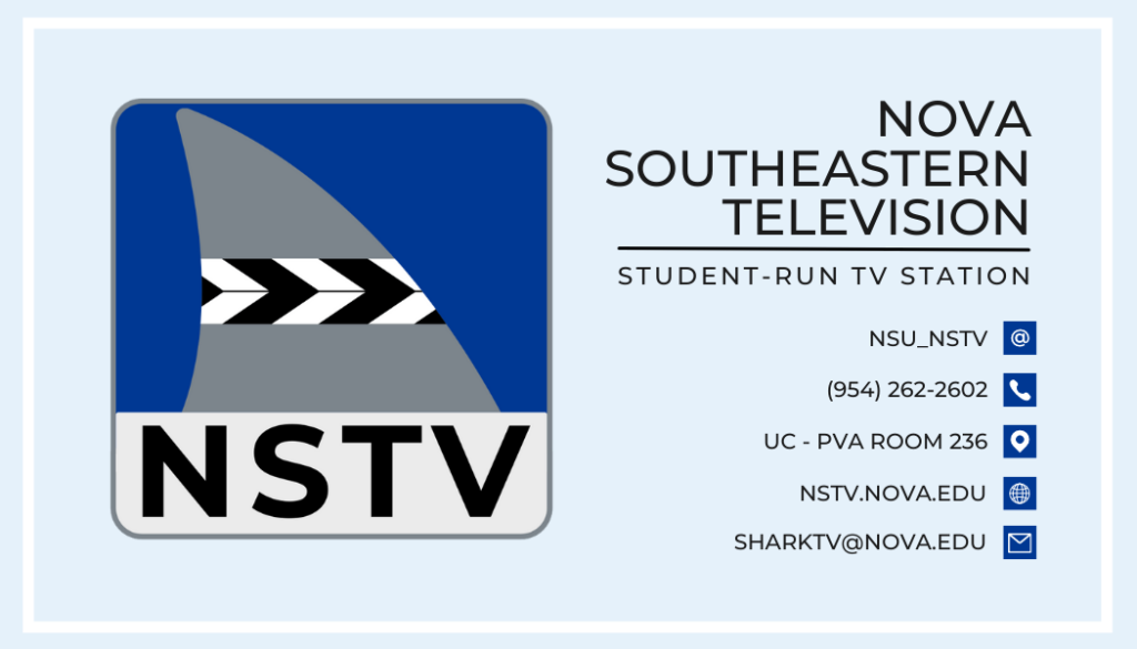
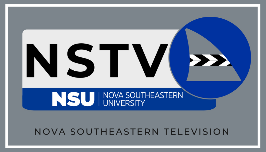
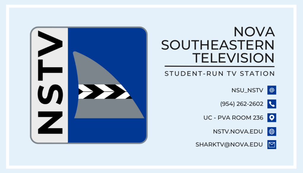
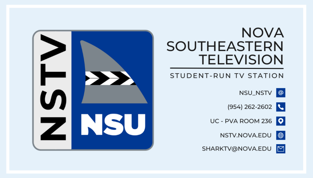
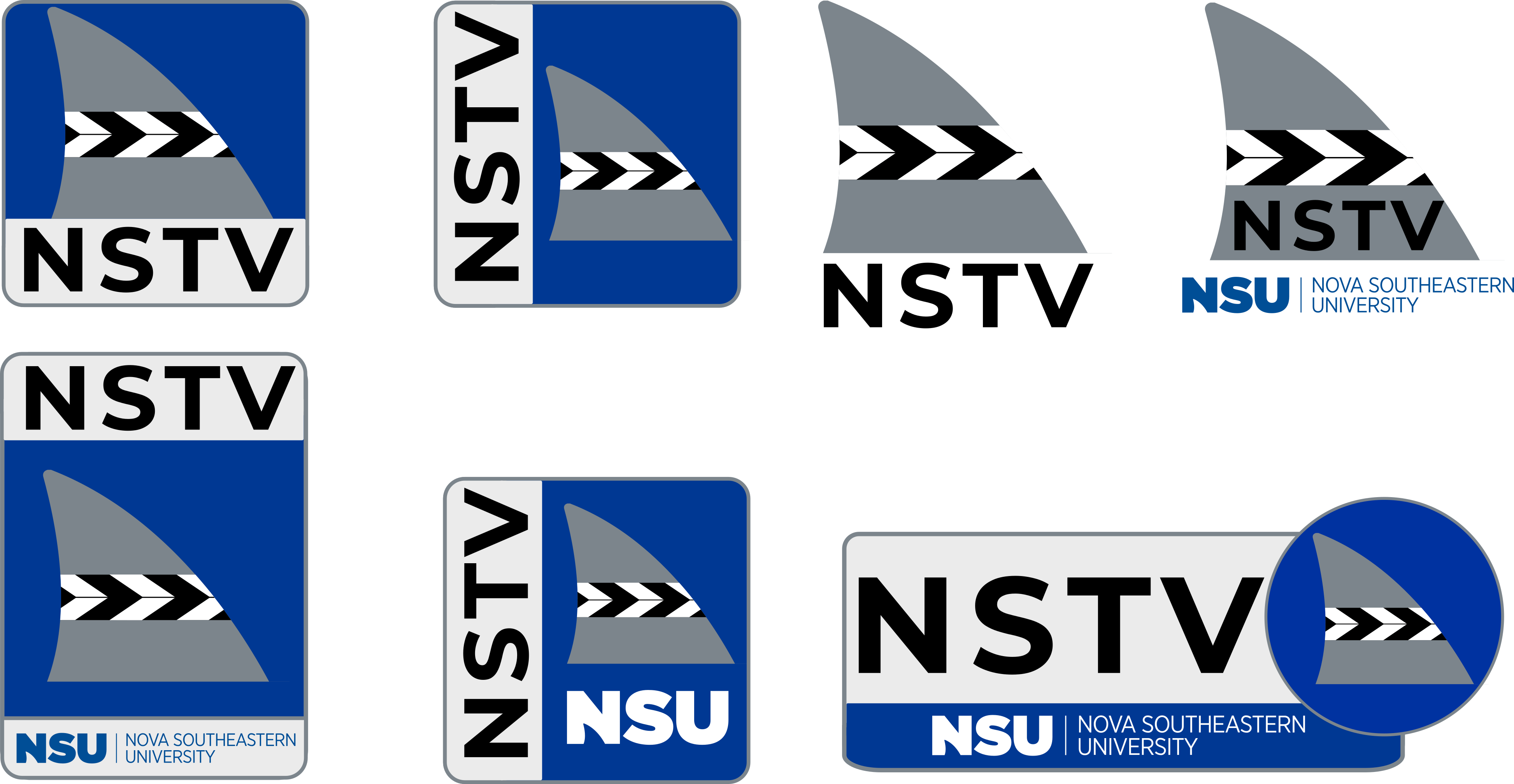
The NSTV logo was produced in the Winter 2022 semester, during a transitory state for NSU’s Student Media. During this semester, I was given the job title of “Assistant Director of Student Media” and assigned with the task of rebranding parts of Student Media’s identity. The concepts seen here are some proposed changes to SUTV – CH 96, NSU’s student-run television station. As opposed to the ambiguity of the acronym “SUTV,” “NSTV” aims to have a clearer 4-letter title. SUTV stands for “Sharks United Television,” coined by the NSU student government’s Sharks United Party in 2009. The name “NSTV” aims to have a clearer title (Nova Southeastern Television), and an erasure of the “Channel 96” identity to segue from coaxial television broadcasts and more so towards online streaming platforms.
The proposed logos were also added to business cards to promote the livestream, social media platforms, and YouTube channel. The goal is to also have an easily identifiable logo that shows a connection to Nova Southeastern University and can be easily replicated onto a microphone flag, shirts, and promotional materials.
Reflection
After taking into consideration some of the feedback from faculty, staff, students, and colleagues, the connections made with the television station should fit with the other aspects of Student Media to show cohesion between the other branches. For example, “NSTV” would be stronger as “MAKO-TV,” which could also be translated to “Mako-Radio” and “Mako-News” for the other branches of Student Media. Similarly, the logos for the other branches could include a shark fin with a pair of headphones (Mako-Radio) and a shark fin with a 1940s-esque fedora with a “press” flag on the brim (Mako-News). Likewise, the name of “NSTV” still posits some questions of what it stands for, whereas “NSU-TV” can make for a clearer message.
As for the business cards, the backgrounds with darker blues should have white text instead of black. A QR code may also be of benefit – or the inclusion of a new website to contain all of Student Media’s information in one place. However, I feel that the “in-your-face” approach of brand identity does create curiosity for a student at NSU to wonder about the message being delivered to them.
The design of the logos were created to solve the problems that I felt existed in the older designs of the “SUTV” logo – text heaviness, complex imagery, and an unclear brand name. These problems would ultimately be resolved with a clearer name, simple imagery, and even the transition away from the outdated technical aspects of the television station. As opposed to a typical writing assignment, this project showed the thought process of rhetorical choices made to images in the place of text. While the brainstorming phase was similar in the way that decisions were thought out, the logos shown here were based on marketing conventions of pre-existing television logos and adapting them to the college setting.
Out of this process, I would say that I was most satisfied with how the main logos look and could appear on the flags of a microphone. I’m a fan of how the slate covers the NSU logo (the fin) and thus ties back to the university’s main brand identity and creating a strong connection to the university itself. Still, I feel that there could be changes made to make the brand identity clearer and more connected to the other branches of Student Media. The conventions of the logo fuse together those of both the university and news broadcasting companies as well. As opposed to the “photo-realistic” color ramps found in modern news logos, the flat colors follow the “Corporate Memphis” approach to brand identity, which is a common trend in the modern setting. Likewise, the same art style grabs an audience member’s attention with exclamatory rhetorical statements for the business card. The concept of remix culture inspired a lot of the rhetorical choices in this project. One could say that the NSU logo was satirized to have the shark fin with a film marker striped across it. Similarly, the familiar designs of pre-existing news logos can also be viewed as a satire of the news industry at large.
