- Maker: Bilal Amodu
- Genre: Project One- Develop a Logotype
- Project Two- Develop a Branded Document
- Level: Graduate
- Program: Composition, Rhetoric, and Digital Media
- Course: WRIT 5800: Editing, Layout, and Design
- Instructor: Dr. Eric Mason
- Semester Created: Winter 2022
Descriptions:
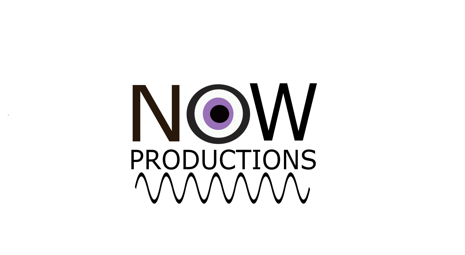
Logo: I designed a logo for NOW, an educational digital content production company that focuses on current affairs, an organization that I would like to create one day. The eye at the center of the logo intends to communicate the organization’s emphasis on observation, while the wavelength below the text communicates the turbulent media environment that the organization situates itself above. The logo was produced within the online vector graphic program Inkscape, though the version of the logo in this post is a PNG file exported from the program. The eye was created through the layering of four circles, while the sign wave was created with drawing tools available on Inkscape. Although the eye’s pupil is purple as a means of attracting viewer attention, a monochrome version of the logo without the purple pupil can exist.

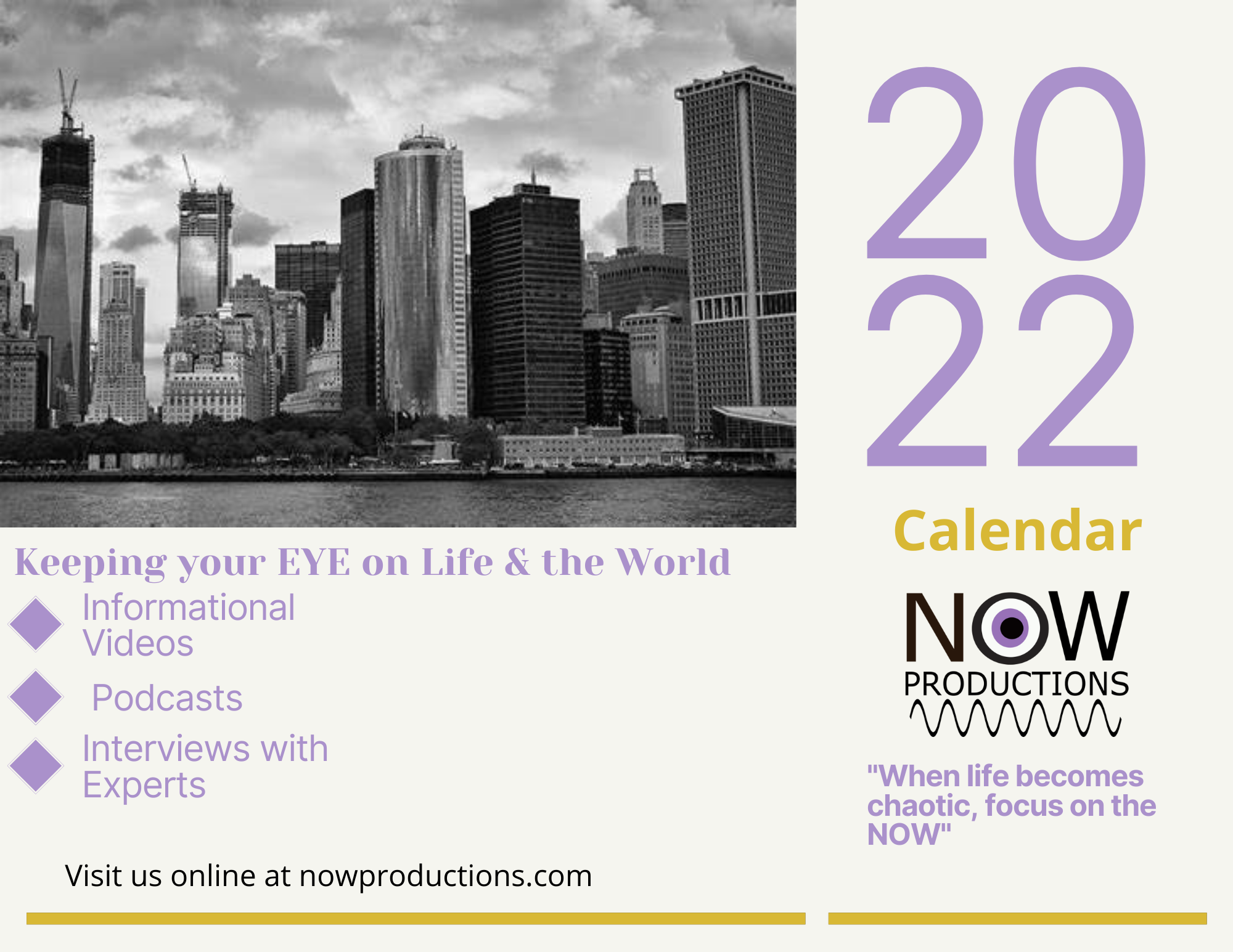
Calendar: I created a calendar cover for NOW to reinforce the organization’s orientation toward current events. The calendar, an unconventional promotional item, nonetheless allows users to document events and developments of their lives, thereby visually organizing their experiences on a day-to-day basis. The calendar’s potential for personal use allows individuals to relate their personal lives to broader events and trends by creating an archive for them to concurrently contextualize personal experiences and external events. The cover also outlines the digital content NOW produces and directs users to the website from which said content may be accessed. The color palette used in the document was influenced by the logo and extended through the use of contrasting colors. The calendar cover was designed on the online platform Canva, and the image on this post is a PNG file exported from the website.

Reflections:
The development of my logo and calendar cover has been influenced significantly by the design process and my unique position as both the designer and client. After unsuccessfully offering my services to other individuals and corporations, I decided to devote my efforts towards developing a logo for a digital current affairs-oriented production company, the type of organization I always dreamed of creating and managing. Although I had sole autonomy and control of the process, I was challenged to articulate my goals for this organization while simultaneously deciding how to represent them visually. I decided to name the organization NOW, to reinforce emphasis on current affairs and distinguish it from more partisan and opinion-oriented news production services. I envisioned the organization as creating commentary news content that would observe rather than speculate and thus serve as a calming resource for news amidst an often turbulent political and media ecosystem. My decision to emphasize observation and calm amidst turbulence inspired the visual elements of the eye and the wavelength, as the eye would represent not only the organization’s commitment to observation and discussion absent an overarching agenda, yet also its efforts to do in a deliberate, thoughtful and tranquil manner, the metaphorical eye of the seemingly incessant media storm. I originally attempted to situate the eye in the center of this wavelength to reinforce the relationship between tranquility and neutrality that I felt defined NOW’s image. After creating a sin wave, I felt it more appropriate to add the term “productions” to the logo to clarify the organization’s identity and the services that it offers. I also positioned the text above the sine wave in order to situate NOW, not amidst the turbulent media environment, yet rather above it as a separate, alternative space that allows for the a thoughtful, reflective discussion often not feasible in a more opinionated media format. With regards to convention, the eye is evocative of the logos of other news and media-oriented organizations, most notably CBS, however the derivation, which is distinct from the CBS eye, intends to reinforce NOW’s emphasis on observation and deliberation of the exterior world.
Although I originally aimed to create a poster advertising NOW, while reviewing template designs on Canva I was instantly attracted to the calendar, since I felt that the document’s conventions and intended use corresponded well with NOW’s decision to emphasize developments in the present moment. The image of the cityscape employed in the design is intended to situate NOW in a complex, modern social environment, and in itself is derivative of the use of cityscapes in promotional photographs and opening shots of news television programming. I understand that this image does presuppose certain attributes of NOW’s audience, such as inhabitance in a metropolitan area and a willingness to believe experts, and in future designs can amend the design to become more accessible to viewers who may not inhabit metropolitan areas or possess a similar willingness to trust educated experts. One challenge I experienced during the development of this document had been structuring, formatting and distributing the visual elements on the page. After speaking to Dr. Mason, I felt compelled to expand NOW’s scope to include not only podcasts, yet other public affair- oriented content, such as educational videos and interviews. I also added the term calendar to clarify the document’s intended use and allow NOW’s emphasis on the present moment to assume a more personal role in its users’ lives. As they rely on NOW’s digital content to remain informed of daily events and developments, the calendar can simultaneously help them document and reflect upon the daily events and developments of their personal lives. also struggled to establish a color scheme for the page, yet once I selected purple as the color of the pupil in the logo, it became easier for me to construct a color scheme that relies on a color scheme of purple and yellow, two contrasting colors. Although this color scheme may appear to some as royal and therefore potentially elitist, in a future document I may employ more subdued shade of purple and yellow that may more effectively convey the calming affect NOW strives to offer its users.
The logotype as of April 16, 2022.

