- Maker: Rafaela Luzuriaga
- Genre: Logo design
- Level: Graduate
- Program: Composition, Rhetoric, and Digital Media
- Course: WRIT 5800: Editing, Layout, and Design
- Instructor: Dr. Eric Mason
- Semester Created: Winter 2024
Description
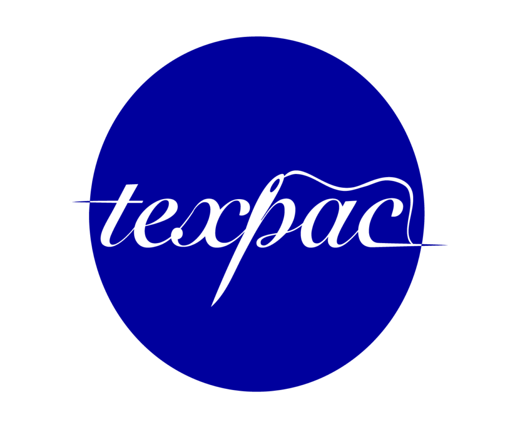
For this project, I decided to give a makeover to my Texpac’s old logo. The company — a textile’s factory and distributor — is owned by my grandfather and has used the same logo since its inception, with very minor changes done over time. While the company has no real wish to change the logo, they were open to suggestions and I took it upon myself to revamp the oldfashioned design by changing essentially everything about it. While the old logo conveyed little to no information about the company’s product, services, or even values, I aimed to give the new logo design some of those hints at what is behind Texpac, the brand. I started my design on Illustrator, and then switched to Inkscape for convenience. The first thing I focused on was finding the right font. I chose a cursive typeface and made small tweaks —such as elongating the arm of the ‘t’ and the end of the ‘c’ as well as turning the ‘p’ into a more needle-like shape — and added a thread coming from the end of the word, as if signifying the sewing together of each letter. Finally, I chose to keep one of the three colors from the original logo — yellow, blue, and red — for simplicity and to step away from the misplaced patriotism that is conveyed in using all three colors of the Ecuadorian flag. I decided to keep the electric blue because of its striking and modern appearance.
Reflection
Going into this project, I had limited experience with design. I’d taken exactly one class on digital design in college, so I had a base understanding of Adobe’s Illustrator, but that didn’t help me in the end since I ended up switching to Inkscape early on in the project. That being said, I think that past experience helped me grasp the workings of both applications somewhat quickly.
Although I went for a simplistic logo, this was mainly influenced by my taste in logo design, and not so much my lack of experience with design. While looking for inspiration, I stumbled upon many logos that I like and appreciate from other brands (e.g. Coca-Cola, Owala, Glossier), all of which have simplistic logo designs that are essentially just the name of the brand with a brand-defining font. No frills, which appeals to me. Noticing what my taste in logos was through this research phase ended up heavily influencing the end-result of my take on Texpac’s logo. My aim was to have a name-only logo that could work with or without a background, and a typeface that was relaxeed and easy to read and eye-catching at the same time.
One thing that helped me in my design process was studying the way other’s did this type of design. While looking at brands whose logo I was most drawn to was a good start, I also appreciated the help of some of Dr. Mason’s class readings, one of them being an article by Before&After Magazine which details some ways you can use letters in logo design. “Design a Logo of Letters!” mostly references the use of initials or few letters, but it helped me get a sense of what works and doesn’t work when connecting letters to each other, which served me when choosing a cursive typeface that worked (and was legible). In the end, I’m satisfied with my logo design’s simplistic and sleek approach. If I were to improve on something, though, it would be the typeface —perhaps make it more experimental and take some advice from B&A like using mid-letter crossbars rather than cursive fonts for connection points between letters (p. 6).
Source
“Design a Logo of Letters!” Before&After, BAmagazine.com.