Description In my podcast, I’m talking about “Audiences.” I picked this topic because it’s important for writers to know who they’re writing for. There’s a writer named Ong who says the same thing. He thinks writers should understand their audience before they start writing. So, in my podcast, I’m going…
-
-
Project 1 LOGO- 5800
Description I designed this logo for a client who has been running her business with the same logo for the past four years. She specifically requested “Fancy” lettering, which led me to select this particular font for her new logo. Additionally, she emphasized a preference for pink as the color…
-
Project 1: Texpac Logo – 5800
Description For this project, I decided to give a makeover to my Texpac’s old logo. The company — a textile’s factory and distributor — is owned by my grandfather and has used the same logo since its inception, with very minor changes done over time. While the company has no…
-
Cackle Logo Typeface
Description The above logo was created to represent the hypothetical ‘academic journal’ titled Cackle. Cackle was intended to be a journal that published scholarship on feminist media studies, the imaginary issue specifically dealt with the intersection between feminist rhetoric and genre studies, such as the Feminist Comedy *wink*. It was…
-
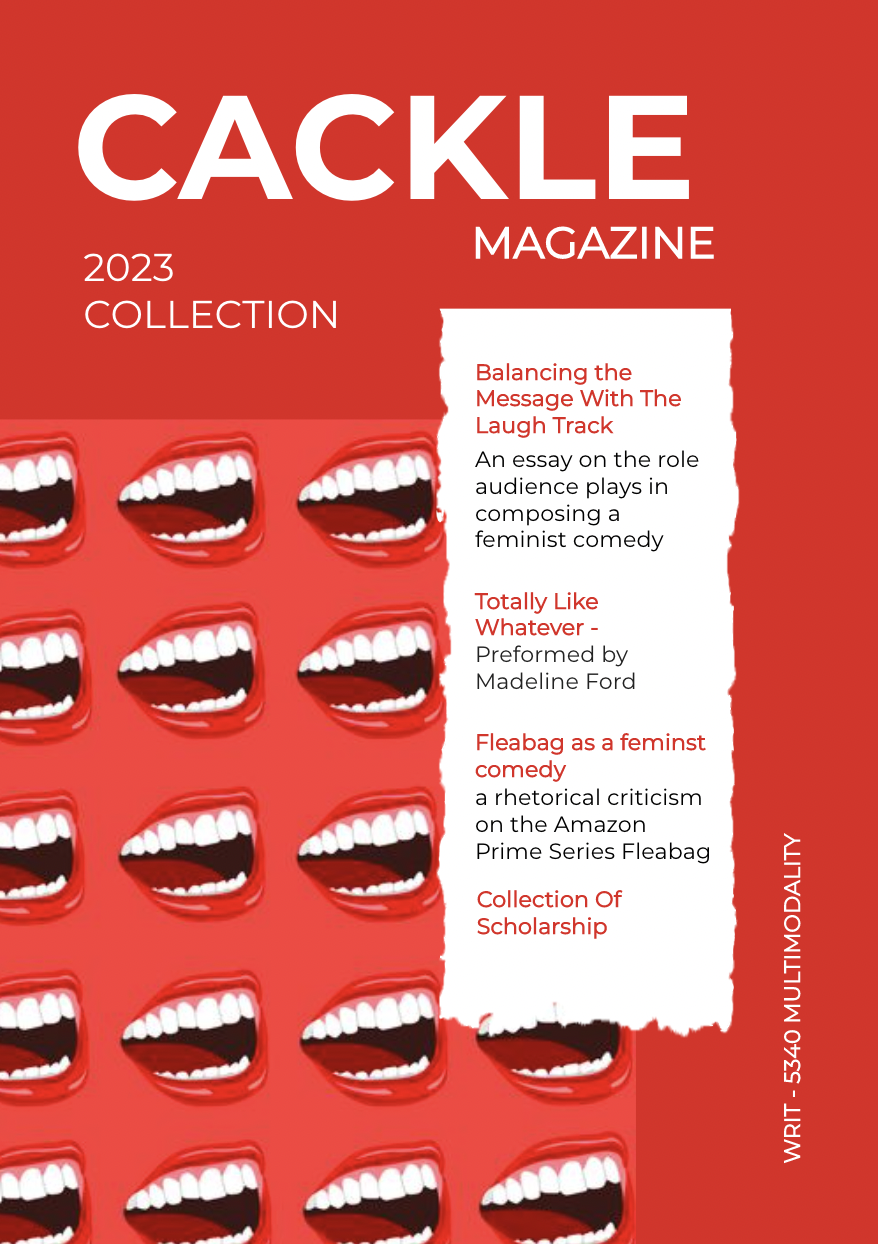
“Cackle” Academic Journal
Maker: Cailin Rolph Genre: Academic Journal Professional Project Level: Graduate Program: Composition, Rhetoric, and Digital Media Course: WRIT 5340: Studies in Multimodality and Digital Media Instructor: Dr. Eric Mason Semester Created: Winter 2023 Description For my final project, I wanted to create a publication that served as a sort of…