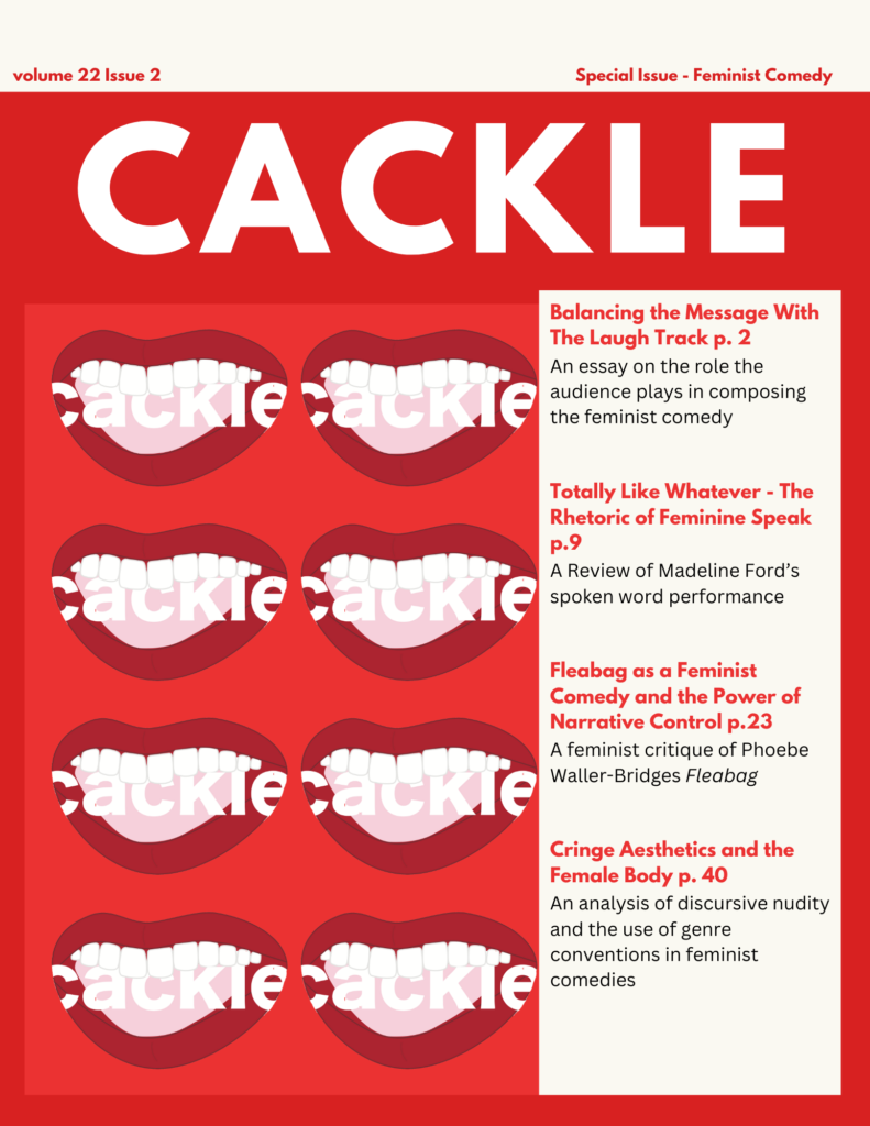
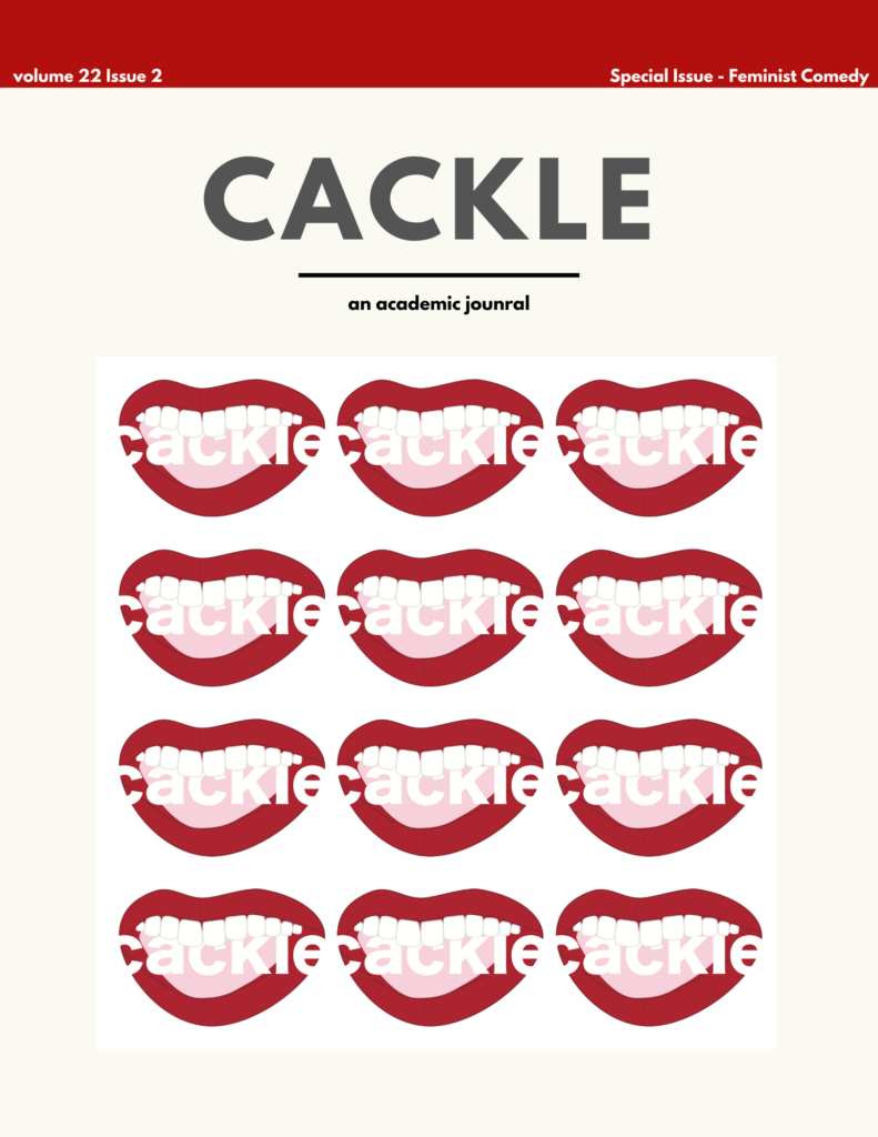
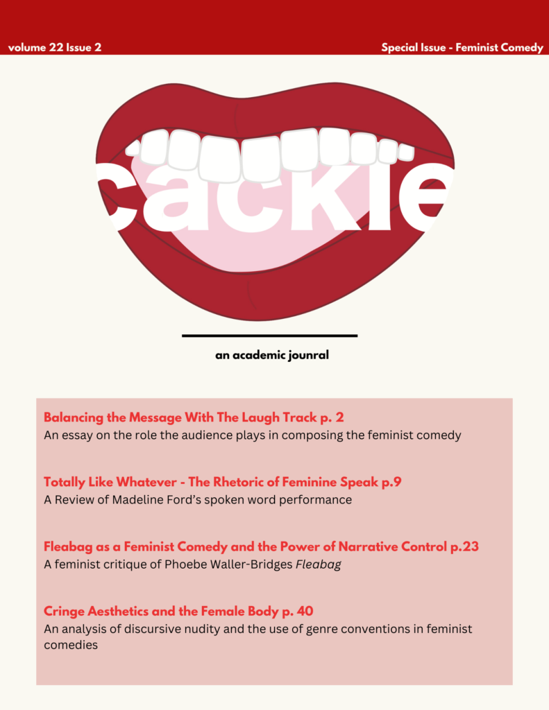
- Maker: Cailin Rolph
- Genre: Logo
- Level: Graduate
- Program: Composition, Rhetoric, and Digital Media
- Course: WRIT 5800: Editing, Layout, and Design
- Instructor: Dr. Eric Mason
- Semester Created: Winter 2024
Description
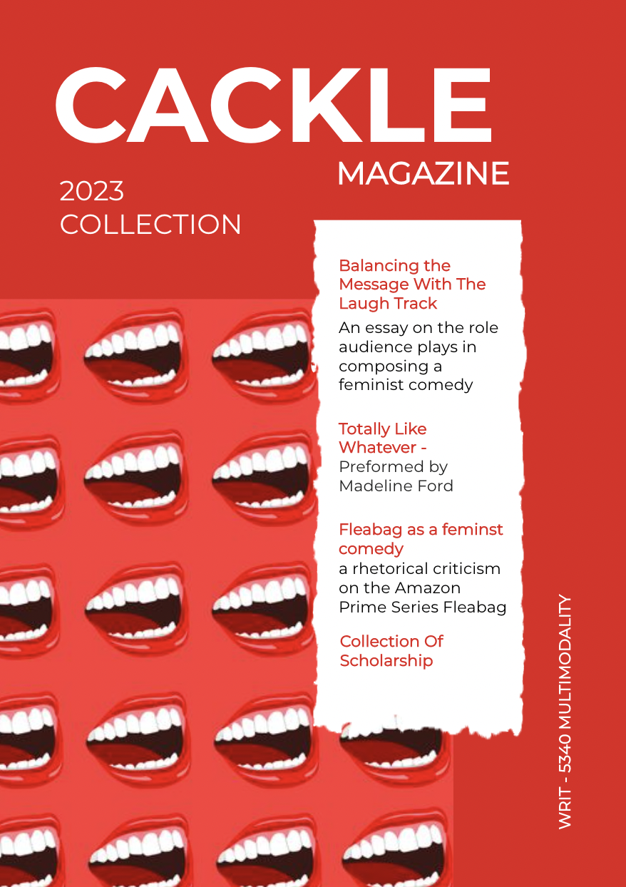
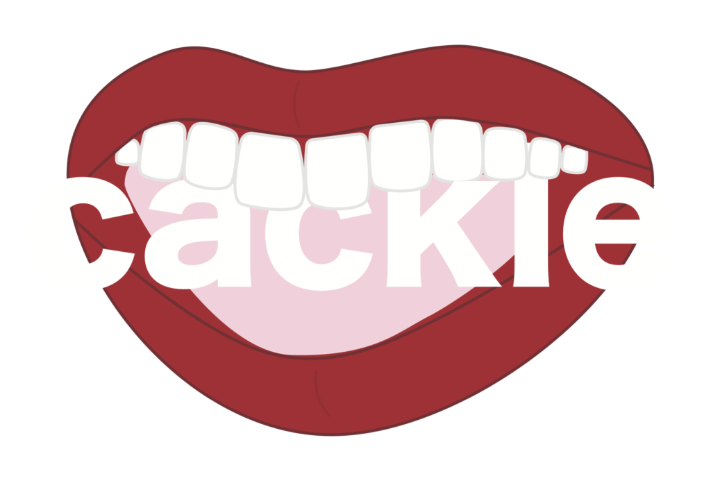
The above logo was created to represent the hypothetical ‘academic journal’ titled Cackle. Cackle was intended to be a journal that published scholarship on feminist media studies, the imaginary issue specifically dealt with the intersection between feminist rhetoric and genre studies, such as the Feminist Comedy *wink*. It was important to me to challenge the image of what we deem ‘professional’ or ‘scholarly’ without being juvenile or inappropriate. In this way, I aimed for this logo to be playful and interesting while also being taken seriously as communicative of the journal’s goals. Logos for academic journals are so often flat, one-dimensional shapes. I wanted this logo to challenge that idea, be interesting to look at. This influenced
Reflection
For me creating this logo was a journey into unfamiliar territory. I had never used Adobe Illustrator intimately and had really only ever relied on it for simple resizing tasks. Initially, the lack of a pre-built template felt like a safety net being ripped away, I was almost crippled by the blank canvas. However, this discomfort proved to be a valuable learning experience.
Instead of relying on a pre-defined structure, I turned to resources like the “Before & After: Designing a Logo from Letters” guides for inspiration. I heavily relied on these B&A presentations to guide me through the aspects of typeface that, being so inexperienced, I wouldn’t know to look for. What would’ve been simply picking a font with a template, becomes a complicated world of strokes and counters. These resources became the building blocks for my creative process.
The most crucial aspect of the logo was its underlying message – a challenge to the traditional norms within scholarship and publishing. With this in mind, I focused on crafting a design that visually hinted at this subversion. This project encouraged me to think much deeper about the design process, and the
Source
Text
