
- Maker: Jasmine Jackson
- Genre: Logotype
- Level: Graduate
- Program: Composition, Rhetoric, and Digital Media
- Course: WRIT 5800: Editing, Layout, and Design
- Instructor: Dr. Eric Mason
- Semester Created: Winter 2020
Description:
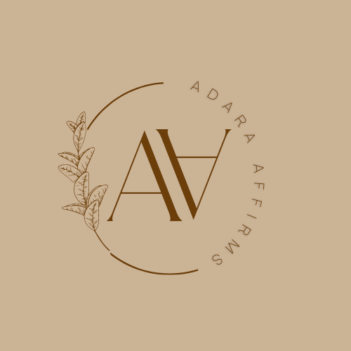
The logotype project began as a very personal exploration of how I envisioned conveying myself as a potential freelance editor. When I enrolled in WRIT 5800, I thought that editing would be my primary area of focus. I had already tested the professional waters so to speak, by taking on a few editing assignments from a legal assistant, fashion designer, and dance company. The logotype project was the perfect opportunity to entertain the possibility of freelancing as an editor. Halfway into the ideation stage of the project, my curiosity for designing a logotype for an actual client was sparked from a conversation with my professor about the numerous businesses seeking logo designs on the web. Ultimately, I decided upon designing a logo for myself because this was a completely new skill that I had not yet felt that I could deliver a polished product to someone for commercial use.
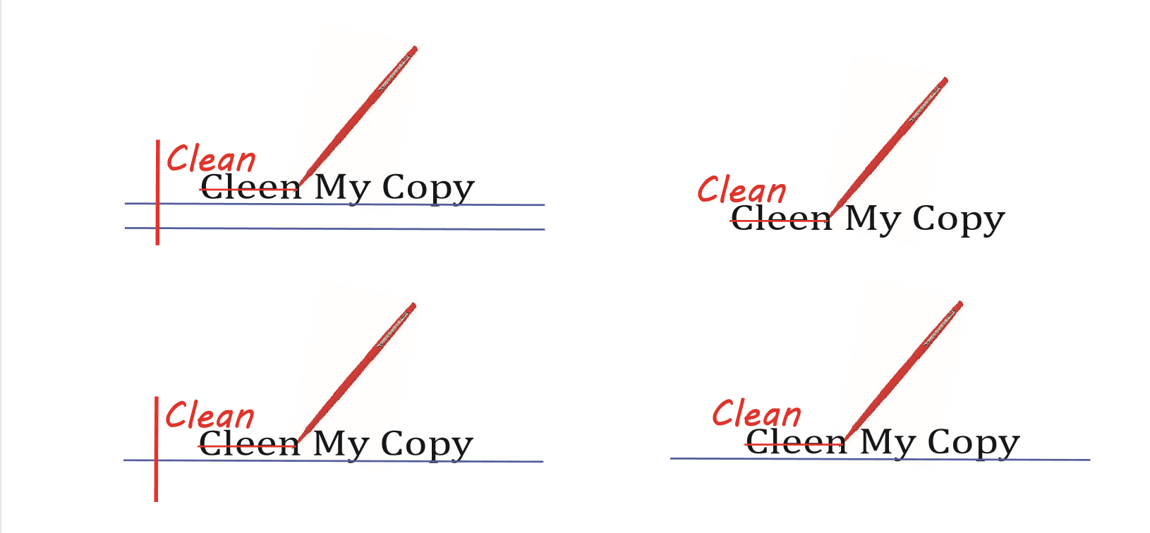
I used Adobe Illustrator to create my logotype. I had already toggled with the tools in Adobe Illustrator in undergrad prior to the logotype project so I was eager to revisit the application. I started by selecting colors that I thought were familiar to the editing process. The colors that I considered were white, blue, red, burgundy, and black. I thought that these colors could convey a clear message because they are the colors found on a sheet of wide-ruled or college-ruled paper and red is the standard color that is used by instructors when making corrections to a printed assignment. I also thought to play with misspelled words in my logo but decided against it because I thought that words would make the final logo look bulky.
Reflection:
The design thinking process affected how I approached the project because it encouraged my to consider the conventional reasons for using particular colors in a logo. For example, I knew that I wanted to use blue after reading about color theory and how blue is often used for designs where reliability were important. What better trait to portray as an editor, than reliability of accuracy! I found the process of designing the actual logo a bit challenging. Although I felt sure about the colors and message that I wanted my logo to portray, I was not sure what form it should look like. Working with a client was not part of my design process so it was necessary for me to reference many logos to get started on my design.


