- Maker: Holland Cutrell
- Genre: Logo, business, batteries, hybrid, car, inkscape
- Level: Graduate
- Program: Composition, Rhetoric, and Digital Media
- Course: WRIT 5800: Editing, Layout, and Design
- Instructor: Dr. Eric Mason
- Semester Created: Winter 2020
Description
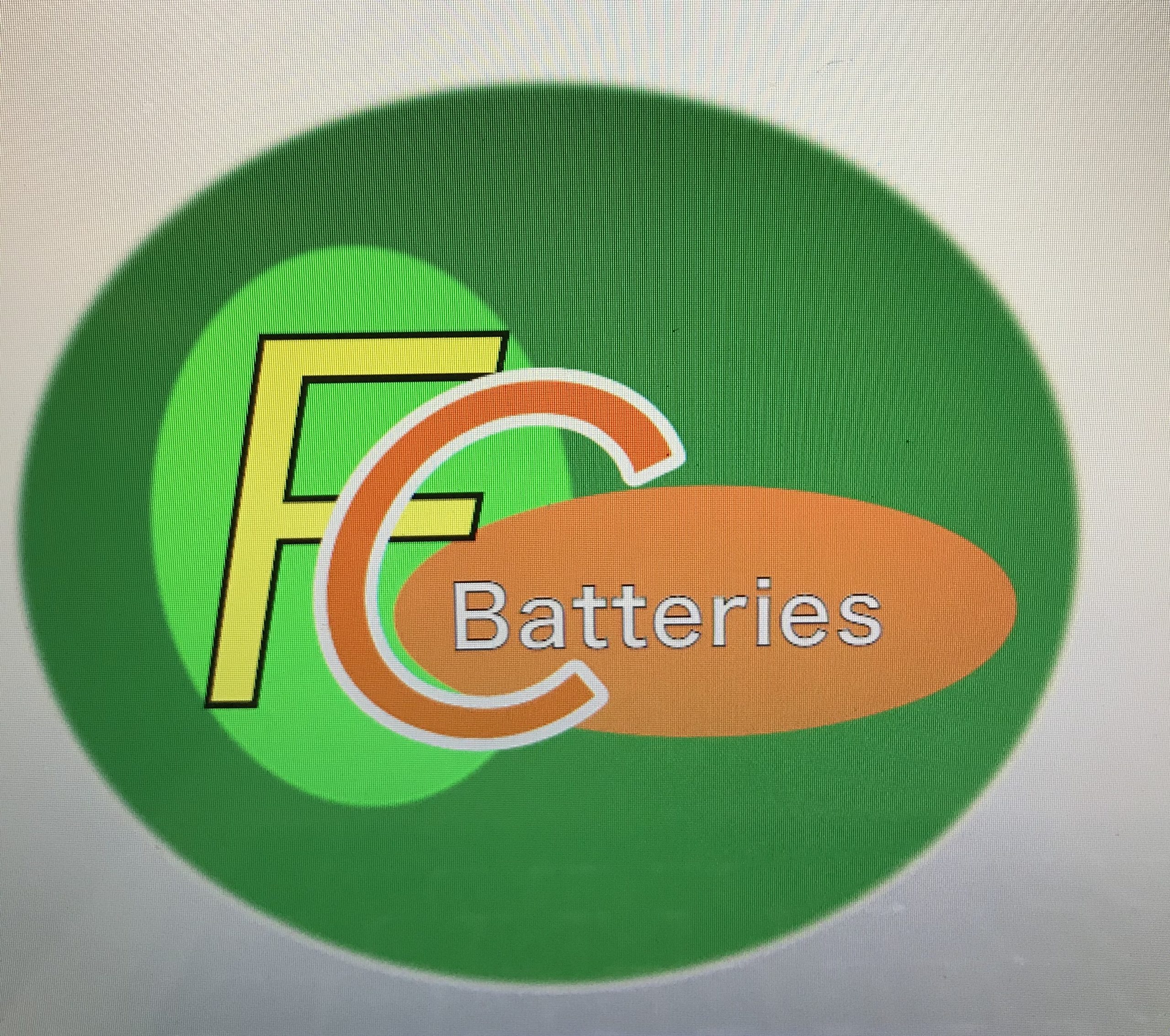
The Fresh Cells logo originated from need. I had a person (client) that I knew was starting up a new business where he would construct, advertise, sell, and install hybrid car batteries, so I reached out and asked if he’d ever thought up a logo for his company. He had some ideas, but never solidified anything, and I ended up collaborating with him to complete my first project in WRIT 5800. He wanted something that would be eye-catching and easy to remember. We opted for a brighter color design that implemented green and orange to showcase the batteries were good for the environment and had lots of clean energy for customers to use. The actual battery cells are also orange so the orange color in my logo matches the orange of the battery cells. The circular design showed off the two focal letters (F&C) nicely, and having the two letters overlap served to give the logo extra character. We went for a clean and fairly simple design; something that would grab attention and make a person ask questions is the goal of the logo. The logo was created through an open-source program called Inkscape.
Reflection
Creating this logo was my first time working with any kind of design software. I feel like my logo looks super easy to make, but I struggled for the good part of a couple weeks to understand the way the software worked. Overall, I feel satisfied with the way I got the letters to work together and the colors look very nice. I wish that I could have done more than just circles for the background to my letters, but I was limited by time and experience. Collaborating with my client had both positive and negative aspects to it because on one hand, I received guidance on what was expected/wanted, however, I was also restricted in my design choices if my client deemed my ideas or prototypes too “much.” He really stressed the idea of simplicity and I suppose I was just excited to try out a new program, but I noticed myself repeating “simple is better” while I tried designing this logo. The constant feedback I got was honestly very helpful. I always showed my progress and waited for a first reaction before starting any questions I had, and my client’s tone and body language told me a lot about whether or not they liked my design or not.
