- Maker: Suzan Kinran
- Genre: Project 3 – Multi-Page Text
- Level: Graduate
- Program: Composition, Rhetoric, and Digital Media
- Course: WRIT 5800: Editing, Layout, and Design
- Instructor: Dr. Eric Mason
- Semester Created: Winter 2026
Description
Here’s the link to view the whole project: https://canva.link/szi0cwat0kgz6sn
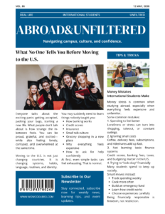
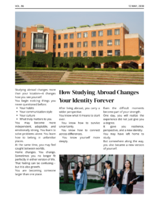
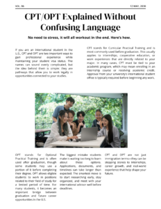
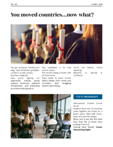
For this project, I designed a four-page editorial newsletter titled Abroad & Unfiltered, created for international students adjusting to life in the United States. The concept was to combine magazine-style layout design with informative and relatable content that feels modern, honest, and visually engaging. Instead of presenting studying abroad as only exciting and glamorous, I wanted the publication to show the real side of the experience—culture shock, identity changes, financial pressure, and learning how to navigate systems like CPT and OPT.
The layout uses a clean grid structure with strong alignment, balanced white space, and clear hierarchy to guide the reader through each page. Headlines are large and bold to immediately capture attention, while body text is organized into columns to reflect the style of professional editorial design. I used a consistent blue, black, and white color palette throughout the project to create unity and a polished look. Blue was chosen because it feels trustworthy, calm, and academic, which matches the topic.
Photography played an important role in the design. Each page includes images of students, campus life, or graduation to reinforce the message and make the content feel personal. I also used contrast between serif headline fonts and sans-serif body fonts to create variety while maintaining strong readability. Features such as sidebars, pull sections, event highlights, and subscription boxes were included to make the newsletter feel realistic and interactive.
Overall, the project combines editing, layout, and design principles to create a publication that informs readers while also telling a story about the international student experience.
Reflection
This project helped me understand how much design affects the way people receive information. I realized that even strong writing can lose impact if the layout is confusing or visually weak. I had to think carefully about spacing, font size, alignment, image placement, and how to keep each page interesting without making it crowded.
One of the biggest challenges was balancing a professional editorial style with a personal and relatable tone. Since the topic connects closely to my own experience as an international student, I wanted it to feel authentic rather than generic. Writing the content was easier because I understand these struggles, but turning those ideas into a visually organized publication required more planning and revision.
I also learned the importance of consistency. Keeping the same colors, typography style, margins, and structure across four pages made the project feel complete and intentional. Small details mattered more than I expected.
If I were to improve the project further, I would experiment more with advanced typography and possibly add more creative page variations while still maintaining unity. Overall, this project made me more confident in combining storytelling with visual communication, which is one of the most valuable lessons I gained from this class.