- Maker: Suzan Kinran
- Genre: Project 1 – Logo Design
- Level: Graduate
- Program: Composition, Rhetoric, and Digital Media
- Course: WRIT 5800: Editing, Layout, and Design
- Instructor: Dr. Eric Mason
- Semester Created: Winter 2026
Description
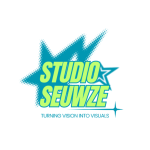
This logo uses a bold, energetic style that feels modern and attention-grabbing. The bright lime green lettering against the teal blue creates a strong contrast, making the brand name stand out immediately. I used a thick, condensed typeface to give the logo confidence and presence, almost like a poster headline.
The halftone starburst shape in the background adds movement and gives the design a retro-pop influence; the star being my favorite shape, also had an effect on the design choice. While the smaller outlined star on the side helps balance the composition. The sparkle element underneath extends the layout horizontally and adds a polished, creative touch. The tagline, Turning Vision Into Visuals, is placed in a cleaner font to contrast the bold headline and make the message easy to read.
Overall, this logo was designed to feel fun, bold, and highly visual, something that would work well for a creative studio or content brand.
Reflection
With this logo, I focused on visual hierarchy and contrast. I wanted the viewer’s eye to go straight to the brand name first, then move down to the tagline. The larger text, bright colors, and layered background effects helped create that flow. I also learned that combining decorative elements with readable typography takes balance. Too many effects can make a logo feel crowded, so placement and spacing mattered a lot here. This design helped me understand how layout choices can create energy without losing clarity.