
- Maker: Alana Garcia
- Genre: Handbook
- Level: Graduate
- Program: Composition, Rhetoric, and Digital Media
- Course: WRIT 5800: Editing, Layout, and Design
- Instructor: Dr. Eric Mason
- Semester Created: Winter 2026
Description
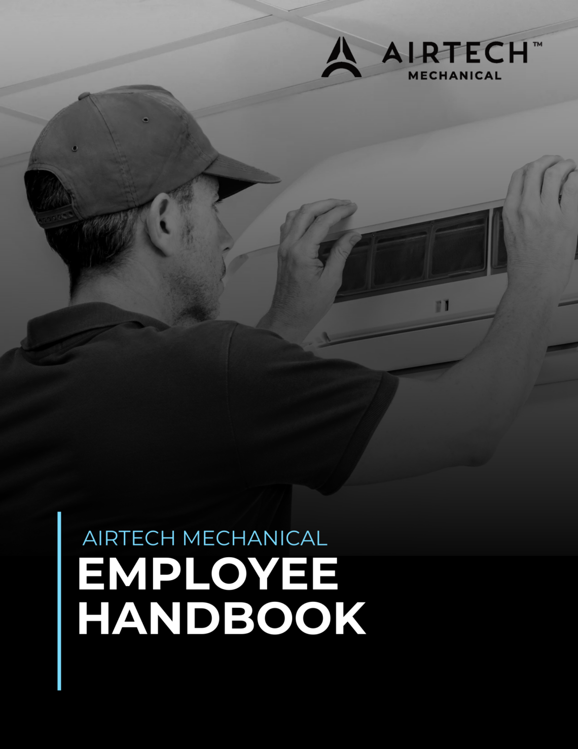
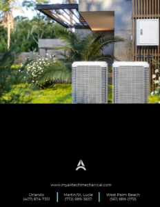
A client hired me to redesign an employee handbook for their company. This project transforms a policy-driven employee handbook into a clear, professional, and visually engaging document. I focused on three main things: clarity, readability, and professional branding. Since I had full creative control, I tried to align the design closely with their website to keep the branding consistent across platforms. I provided the company a couple of front, back, and footer options before working on the gut.
Reflection
Before starting this project, I conducted research on the company, reviewed their socials, and asked the client about their visual preferences. As I began the design process, I created a couple of design options for the front and back cover. I’ve become accustomed to providing clients with a few choices to choose from. I tried to go for a more minimal, professional, and clean look. The option selected, as shown above, leans a bit more into contrast and visual hierarchy. While working on the gut, I used spacing and alignment to keep everything balanced and easy to read. I created a simple style system with clear hierarchy: heading 1, heading 2, and body text. I used blue for the main headings to tie into branding and to draw attention to key policies, and black bold for subheadings to keep things structured. The goal was to make it really easy for employees to find information quickly since the document includes a lot of policies. Hiippala discusses how layout and rhetorical structure are intertwined, which basically means the way information is arranged affects how we understand it. This is why I made sure that the heading levels and section breaks were not just visual elements but also serve as a guide to help the reader navigate through the document. Hiippala also mentioned how page layout uses space to signal relationships between elements. Which, again, is why I kept things consistent with the same headers, same spacing, same formatting. Finally, I provided them with both a printable file as well as a digital fillable version.