- Maker: Denisia Martimbor
- Genre: Multi-page Layout
- Level: Graduate
- Program: Composition, Rhetoric, and Digital Media
- Course: WRIT 5800: Editing, Layout, and Design
- Instructor: Dr. Eric Mason
- Semester Created: Winter 2026
Description
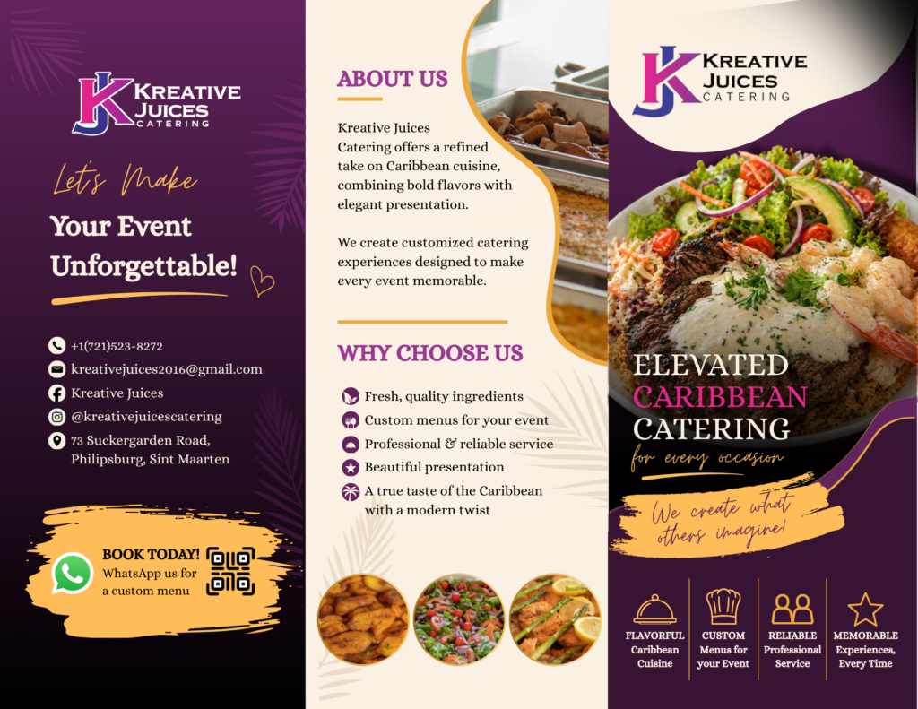
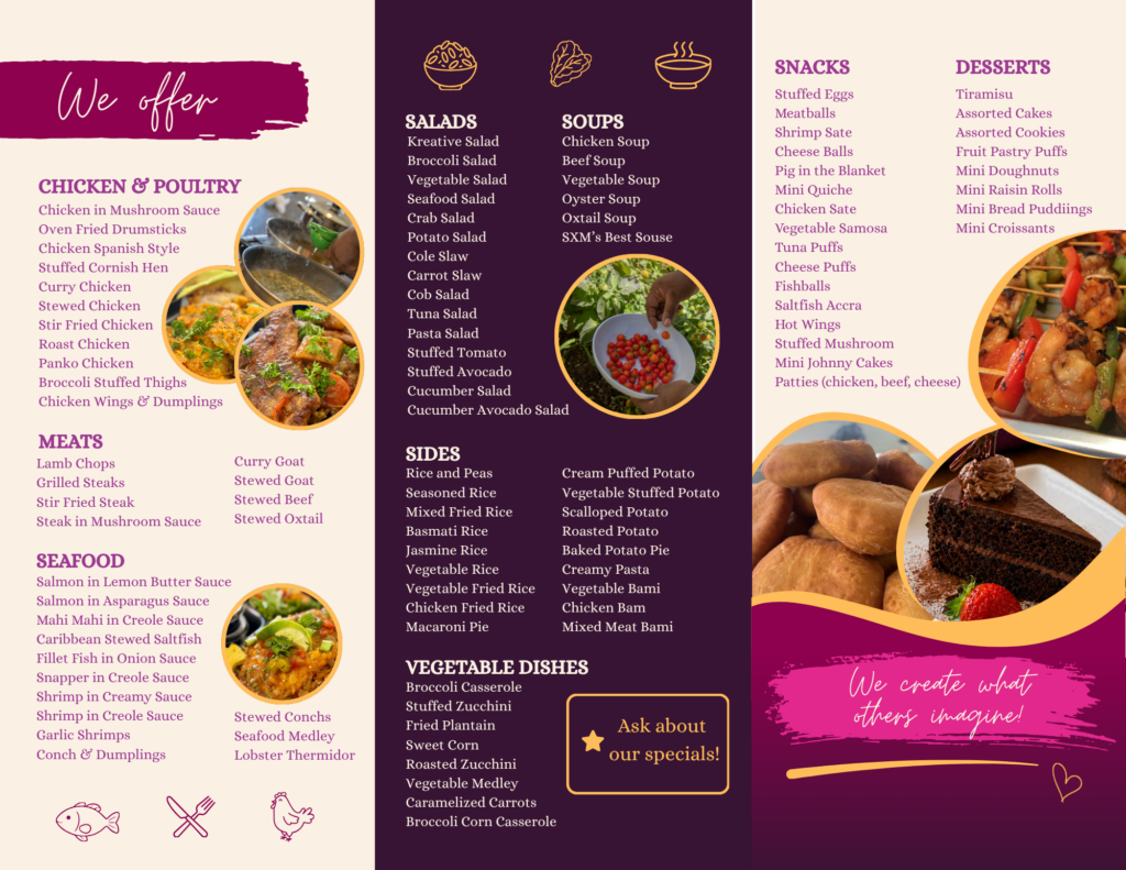
This project involved designing a multi-page brochure for Kreative Juices Catering, a Caribbean-based catering business. The goal was to create something visually appealing that clearly presents menu items and services while also reflecting the brand’s identity.
I created the brochure using Canva, focusing on layout, color, and overall organization. The design includes different sections such as an introduction to the business, menu categories, featured meals, and contact information. I used a purple and gold color palette to give it a more elevated, professional look while still keeping it vibrant and eye-catching. I also incorporated food images to make the brochure more engaging and to help visually represent the menu items.
Throughout the process, I paid attention to spacing, alignment, and structure so the brochure would be easy to follow. The goal was not just to make it look nice, but to make sure the information was clear and organized in a way that guides the reader.
Reflection
This project showed me that design is more than just making something look good, but about how meaning is communicated visually. The design thinking process really affected how I worked because I kept going back and revising different parts of the layout, color choices, and structure until everything felt balanced.
Compared to a typical writing assignment, this was very different because I had to think more about visuals than just words. I had to consider how someone would read and move through the brochure, which made things like hierarchy and spacing really important. I was most satisfied with how cohesive the final design looked, especially the color scheme and overall layout. One challenge was making sure it didn’t feel too crowded while still including all the necessary information.
I followed design conventions like keeping a clear visual hierarchy and making sure everything was readable, but I also experimented with color and layout to reflect the brand’s Caribbean identity. Since this was based on a real business, I also had to think about how it would actually be used in a professional setting, which made me more intentional with my choices.
Overall, this project helped me understand that writing and design go hand in hand, and that how something is presented is just as important as the content itself.